Building Trust with Clear and Clean Design
In a world saturated with information and constantly evolving technologies, the importance of trust has never been more paramount. Whether navigating a bustling e-commerce site or exploring a sleek app interface, users are drawn not just toward functionality, but also toward experiences that feel authentic and dependable. Enter the philosophy of clear and clean design—a powerful approach that transcends aesthetics to foster trust and engagement. This article delves into the vital connection between design clarity and user confidence, exploring how intentional choices in layout, typography, and color can transform tentative visitors into loyal advocates. As we unravel the principles of transparency, simplicity, and coherence, we invite you to discover how these elements can not only enhance usability but also build lasting relationships within the digital landscape. Join us on this journey to understand that in design, clarity is not just a preference; it is a pivotal foundation for trust.
Table of Contents
- Establishing Credibility through Visual Consistency
- The Role of Simplicity in User Experience
- Transparency in Design Choices for Enhanced Connection
- Color Psychology and Its Impact on Trustworthiness
- Concluding Remarks

Establishing Credibility through Visual Consistency
When it comes to establishing trust, visual consistency serves as the cornerstone of effective design. Consistent design elements—from color schemes and typography to layout techniques—create a sense of familiarity that resonates with users. This familiarity fosters a connection that encourages users to engage further with your content. More importantly, when every aspect of your design aligns, it reduces cognitive load, allowing users to focus on the message rather than recovering from jarring discrepancies. This not only enhances user experience but also solidifies your brand’s identity in the crowded digital landscape.
To achieve this level of consistency, consider the following design practices:
- Select a cohesive color palette that reflects your brand personality and is used uniformly across all platforms.
- Choose a limited number of fonts to maintain visual harmony and readability throughout your content.
- Implement a grid system to structure your layouts, ensuring that every element complements the others without competing for attention.
Here’s a simple guideline that highlights the importance of visual consistency:
| Consistency Element | Impact on Trust |
|---|---|
| Color Usage | Familiarity with Brand |
| Typography | Enhanced Legibility |
| Layout Standardization | Improved Navigation |

The Role of Simplicity in User Experience
In the digital landscape, where users are bombarded with information from every direction, simplicity becomes a guiding principle for effective design. A clear and clean interface not only enhances usability but also fosters an environment of trust. By employing minimalist design elements and limiting distractions, designers can direct users’ focus towards essential actions, leading to improved user satisfaction. A streamlined experience invites users to navigate a website or application with effortless ease, which in turn, boosts their confidence in the brand. Key aspects to consider for embracing simplicity include:
- Consistent color schemes to promote visual harmony
- Intuitive navigation paths to minimize confusion
- Clear typography that enhances readability
- Strategically placed white space to ease cognitive load
When users encounter a clutter-free design, they are more likely to engage with content and complete desired actions. Additionally, fostering simplicity can lead to increased accessibility, as users with different abilities can more easily understand and interact with an interface devoid of unnecessary complexity. A popular approach to achieving this is using progressive disclosure—revealing information in layers as users engage more deeply. By adopting a simplicity-first strategy, brands can communicate messages effectively, ensuring that users feel empowered rather than overwhelmed:
| Design Principle | Benefit |
|---|---|
| Minimalism | Enhances focus on essential content |
| Intuitive Navigation | Reduces user frustration |
| Readable Typography | Improves comprehension |
| White Space | Boosts content visibility |

Transparency in Design Choices for Enhanced Connection
In the realm of design, clarity isn’t just an aesthetic choice; it’s a fundamental element that fosters deeper connections with users. When design choices are made with transparent intentions, it creates an environment where users feel valued and understood. By employing a straightforward visual language, designers can convey messages more effectively and empower users to navigate effortlessly through their platforms. This approach can be achieved through:
- Consistent Color Schemes: Using familiar hues to evoke emotions and signal actions.
- Intuitive Layouts: Crafting structures that guide the user’s journey seamlessly.
- Clear Typography: Selecting fonts that enhance readability and maintain brand voice.
Moreover, a transparent design process involves communicating the reasoning behind design decisions to users. This transparency not only demystifies the design but also cultivates a sense of trust, making users more likely to engage with the brand. For example, unveiling user-testing feedback or design iterations through an interactive table can highlight commitment to improvement:
| User Feedback | Design Changes Made | Outcome |
|---|---|---|
| Confusing navigation | Simplified menu structure | Increased user engagement by 25% |
| Text too small | Enhanced font size and contrast | Improved readability ratings by 40% |

Color Psychology and Its Impact on Trustworthiness
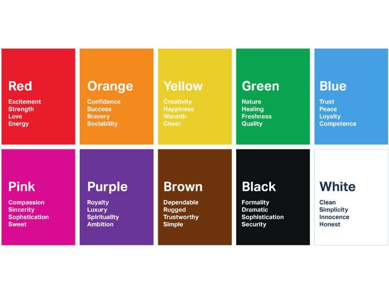
Color choices in design can profoundly influence how people perceive trustworthiness. Various hues can evoke distinct emotions and associations, ultimately guiding consumer behavior. Blue, for instance, is often linked with reliability and professionalism, making it a popular choice for financial institutions and tech companies. Similarly, green frequently resonates with health and tranquility, often utilized by brands aiming to convey sustainability and well-being. In contrast, warmer tones like red can evoke urgency but may also polarize opinions, which highlights the importance of understanding the emotional responses each color invokes.
Creating a visually appealing design leads not only to aesthetic satisfaction but also reinforces a brand’s integrity. A few strategic choices can enhance perceived trustworthiness:
- Consistent Palette: Using a cohesive color scheme fosters familiarity, making users feel secure.
- Minimalism: Simplified designs reduce clutter and enhance focus, conveying transparency.
- Contrast: Employing contrasting colors for calls to action can direct attention without overwhelming users.
To illustrate the impact, consider the following breakdown of colors and their psychological associations in design:
| Color | Association | Impact on Trust |
|---|---|---|
| Blue | Reliability | High |
| Green | Health | Moderate |
| Red | Urgency | Variable |
| Black | Elegance | High |
| Yellow | Optimism | Low |
Concluding Remarks
the journey towards building trust through design is paved with clarity and simplicity. Just as a well-structured blueprint creates a solid foundation for a building, a clean and intuitive design fosters an environment where users feel secure and valued. By prioritizing transparency, maintaining consistency, and focusing on user experience, designers can cultivate a connection that transcends visual appeal, ultimately leading to lasting relationships with their audiences. As we move forward in an increasingly digital world, let us remember that the power of design lies not merely in its aesthetics but also in its ability to communicate, engage, and instill trust. So, as you embark on your design endeavors, let clarity be your compass, guiding you toward a future where trust is not just built, but seamlessly woven into the very fabric of your creations.
