How Colours Shape Your Website’s Personality
How Colours Shape Your Website’s Personality
In the vast digital landscape, where first impressions are often made in mere seconds, the color palette of your website is more than just a decorative choice; it’s a powerful communicator of your brand’s identity. Like a brushstroke on a canvas, colors evoke emotions, influence perceptions, and create a distinct personality that resonates with visitors. From the vibrant reds that ignite passion to the calming blues that inspire trust, each hue carries a psychological weight that can sway user behavior in subtle yet profound ways. In this article, we will explore the intricate relationship between color and web design, uncovering how the shades you choose can transform your site from a simple collection of pixels into a compelling experience that reflects your brand’s essence and engages your audience. Join us as we dive into the world of colors and discover how they can shape not just your website’s visual appeal, but its very personality.
Table of Contents
- Exploring the Psychological Impact of Color Choices
- The Role of Color in Brand Identity and Recognition
- Creating Emotional Connections Through Color Palettes
- Practical Tips for Implementing Color Theory in Web Design
- In Conclusion

Exploring the Psychological Impact of Color Choices
The colors you choose for your website do much more than enhance its aesthetics; they profoundly influence how visitors perceive your brand. Different hues evoke various emotional responses, helping to create a distinct personality for your website. For instance, blue often symbolizes trust and professionalism, making it a popular choice for corporate sites, while red can evoke feelings of excitement and urgency, suitable for sales or promotional pages. When selecting a color palette, consider how each color resonates within your target audience, ensuring that the overall mood aligns with the message you wish to convey.
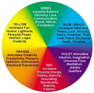
In addition to basic colors, using a color scheme can further refine your site’s impact. Understanding the psychological effects of various color combinations can lead to more effective branding and user engagement. Here’s a simplified breakdown of color meanings to guide your choices:
| Color | Common Associations |
|---|---|
| Blue | Trust, Calmness, Reliability |
| Red | Passion, Energy, Urgency |
| Green | Growth, Harmony, Safety |
| Yellow | Optimism, Clarity, Warmth |
| Purple | Luxury, Creativity, Ambition |

The Role of Color in Brand Identity and Recognition
The hues you choose for your website are not just aesthetic choices; they resonate with emotions, convey messages, and play a pivotal role in defining your brand’s personality. Different colors evoke distinct feelings and associations, which can significantly impact user perception and behavior. For instance, blue often instills a sense of trust and reliability, while red ignites excitement and urgency. It’s crucial to align your color palette with the values and characteristics of your brand, fostering a consistent identity that resonates with your audience.
Moreover, the strategic use of colors enhances recognition and memorability. A well-defined color scheme can help create a visual language that speaks on behalf of your brand, strengthening its presence in a crowded marketplace. To illustrate the impact of color choices, consider the following table highlighting popular brands and their signature colors:
| Brand | Signature Color | Emotional Association |
|---|---|---|
| Coca-Cola | Red | Excitement, Passion |
| Blue | Trust, Dependability | |
| Starbucks | Green | Growth, Calmness |
By carefully selecting colors that communicate your brand’s essence and values, you empower your website to create instant recognition and foster loyalty among users. Consider what emotions you wish to evoke and how your chosen palette can reinforce your brand’s message in the digital space.

Creating Emotional Connections Through Color Palettes
Colors are more than mere aesthetics; they speak a language all their own, stirring emotions and building connections with your audience. Each hue can invoke a specific feeling or memory, making it essential for web designers to understand the emotional impact of their choices. For instance, blue often conveys trust and dependability, making it a popular choice for financial institutions, while yellow can evoke feelings of optimism and warmth, ideal for creative industries. By considering the psychology behind colors, you can craft a visual narrative that resonates deeply with your users, influencing their perceptions and interactions.
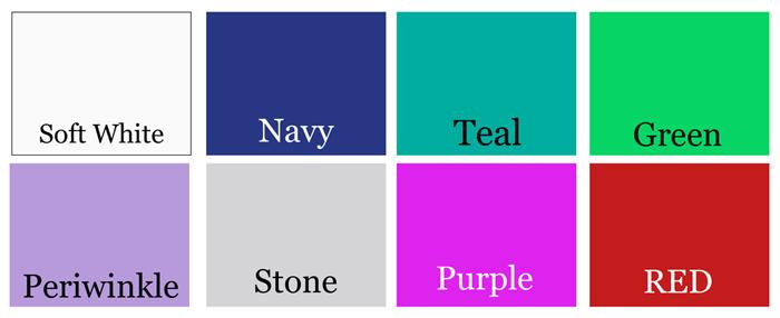
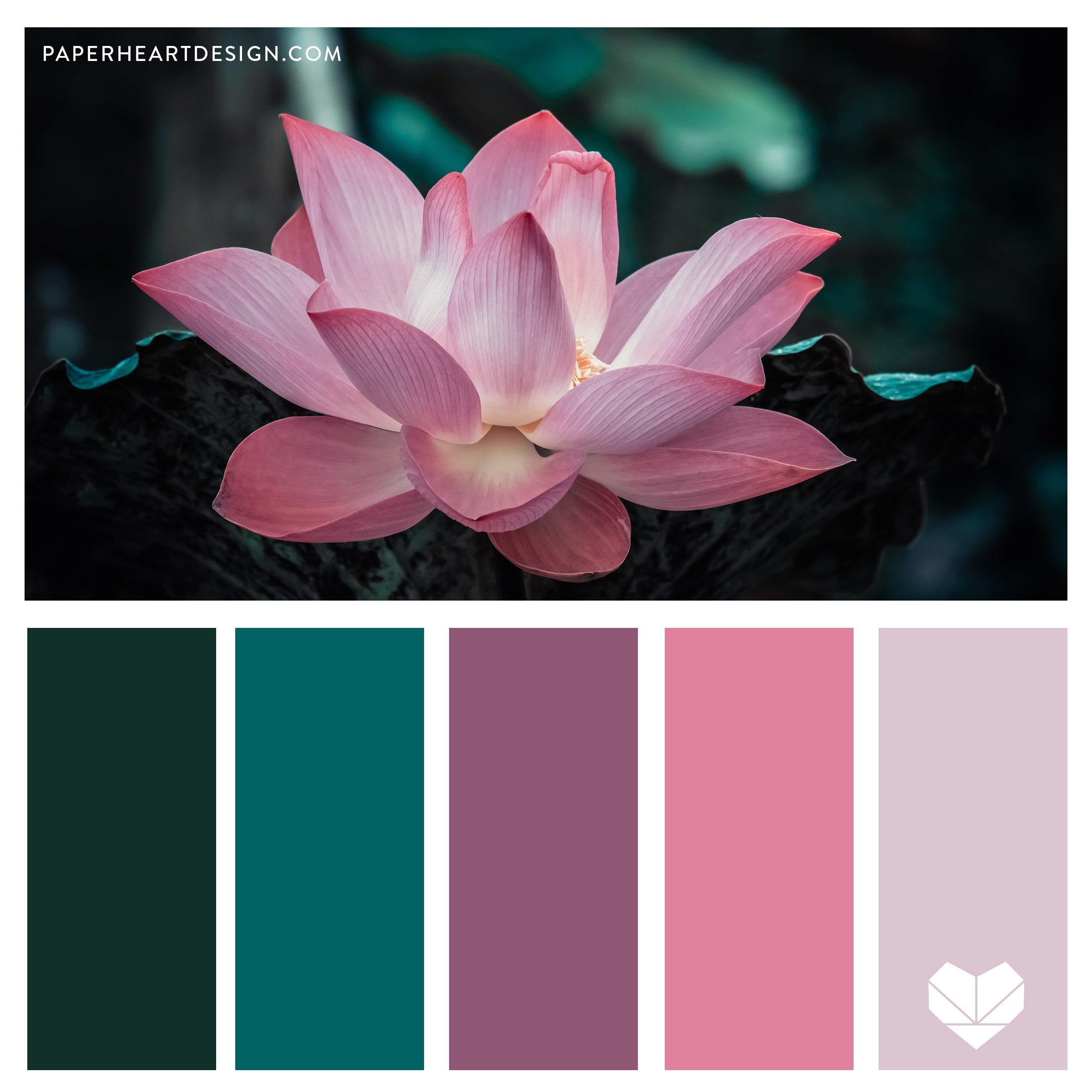
When designing a site, it’s important to create a harmonious color palette that complements your brand’s personality. Consistency in color use not only enhances your website’s aesthetics but also reinforces your brand identity. Consider the following aspects when choosing your colors:
- Brand Message: Define what you want to communicate through your color choices.
- Target Audience: Understand the demographics and preferences of your users.
- Contrast and Readability: Ensure your colors improve user experience, making text easy to read.
Incorporating a well-planned color scheme can significantly enhance user engagement. Below is a simple table showcasing some common colors along with their associated emotions:
| Color | Emotion |
|---|---|
| Red | Excitement & Passion |
| Green | Peace & Growth |
| Purple | Luxury & Creativity |
| Orange | Enthusiasm & Energy |

Practical Tips for Implementing Color Theory in Web Design
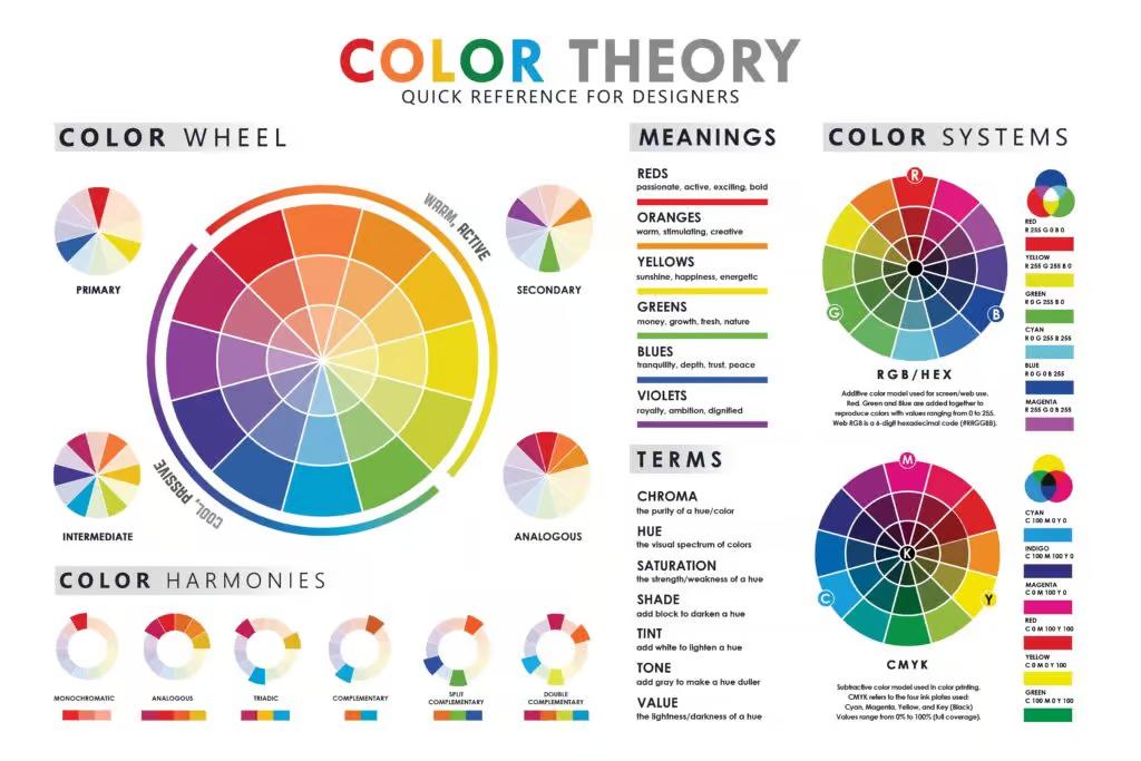
To effectively incorporate color theory into your web design, it’s essential to consider the emotions and associations different colors evoke. Start by defining the brand personality you wish to convey. Utilize a color palette that aligns with this vision by selecting complementary colors for a harmonious look or contrasting colors to create dynamic emphasis. When designing your website, remember the following tips:
- Use color psychology as a guide for your choices.
- Limit your palette to three main colors to avoid overwhelming visitors.
- Test colors on different devices to ensure consistency in appearance.
Once your palette is established, apply colors thoughtfully to enhance user experience. For instance, use a bold color for call-to-action buttons to draw attention, while softer tones can create a relaxing background. Additionally, consider the accessibility of your design, ensuring contrast ratios are sufficient for readability. Here’s a simple reference table to guide your color selection:
| Color | Emotion | Usage |
|---|---|---|
| Red | Passion, Urgency | Call-to-action, Alerts |
| Blue | Trust, Calm | Headers, Backgrounds |
| Green | Growth, Freshness | Success indicators, Labels |
In Conclusion
In the vibrant world of web design, colors do more than just please the eye; they tell a story, evoke emotions, and shape perceptions. As we’ve explored, each hue carries its own set of associations and can significantly influence how users interact with your website. Whether you opt for bold reds to convey excitement or soothing blues for tranquility, the strategic use of color can enhance your brand’s personality and deepen user engagement.
As you embark on your design journey, remember that color is a powerful tool—not just an aesthetic choice. Take time to understand the psychological impact and cultural significance of your palette, and let it guide your decisions. By thoughtfully intertwining colors with your website’s narrative, you can create a cohesive experience that resonates with your audience and distinguishes your brand in the digital landscape.
So, as you evaluate your colors, think beyond the surface. Embrace the rich language of color and let it elevate your website to new heights, where every visitor feels a connection, sparking curiosity and inviting exploration. The right colors can truly transform a simple website into a vibrant personality that reflects your brand’s essence. Happy designing!
