The Art of Creating Intuitive Website Navigation
In the vast digital landscape, where the average user’s attention span flits like a butterfly, the importance of intuitive website navigation cannot be overstated. Imagine stepping into a labyrinth where every twist and turn feels uncertain; frustration mounts, and the allure of discovery quickly fades. In contrast, a well-crafted navigation system acts as a guiding star, illuminating the path to information and enhancing the overall user experience. As we dive into the art of creating intuitive website navigation, we’ll explore the delicate balance of design and functionality that can transform a mere collection of web pages into a seamless journey. From understanding user behavior to the strategic placement of elements, this article will unravel the principles that empower users to move effortlessly through the virtual world, ensuring that what they seek is never more than a click away.
Table of Contents
- Understanding User Behavior to Enhance Navigation Design
- Key Principles of Intuitive Menu Structures
- The Role of Visual Hierarchy in Guiding User Experience
- Testing and Iterating: Refining Navigation Through Feedback
- Wrapping Up

Understanding User Behavior to Enhance Navigation Design
To create a navigation system that resonates with users, it’s essential to delve into patterns of behavior. By analyzing how users interact with a website, designers can identify common pathways and preferences that guide their online experience. Understanding these nuances will involve:
- User Testing: Observing individuals as they navigate can reveal friction points.
- Analytics Data: Utilizing tools like Google Analytics provides insights into popular pages and drop-off rates.
- A/B Testing: Experimenting with different navigation styles can help determine what feels most intuitive.
A thoughtful approach to these observations allows designers to cultivate an environment where users can effortlessly find what they are looking for. A well-organized site benefits from clear hierarchies and logical groups. Consider the following attributes for your navigation:
| Attribute | Description |
|---|---|
| Consistency | Maintain similar layouts and labels across all pages. |
| Clarity | Use straightforward language that’s easy to understand. |
| Accessibility | Ensure navigation is usable for individuals with disabilities. |

Key Principles of Intuitive Menu Structures
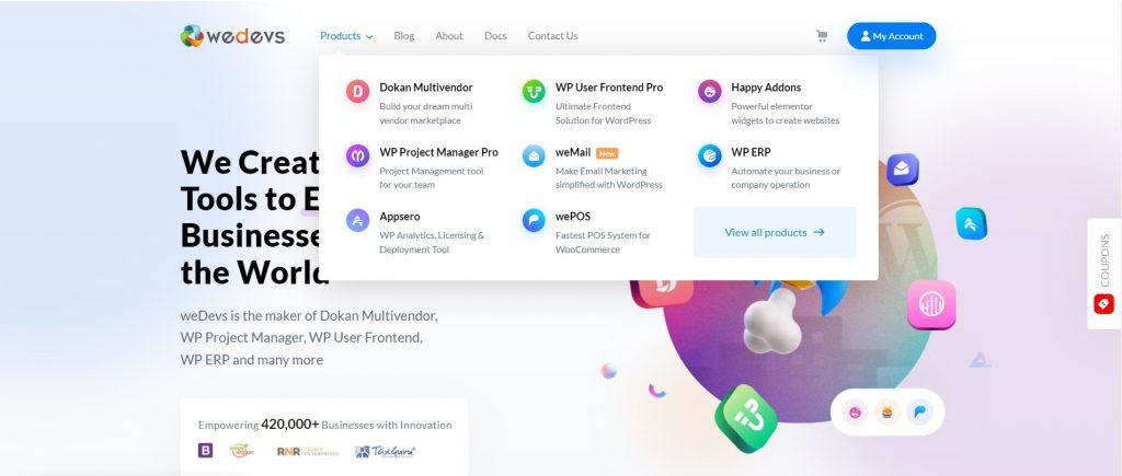
Designing an intuitive menu structure is akin to crafting a well-organized library. Each section must complement the others, making it easy for users to find exactly what they need without unnecessary detours. Key aspects to focus on include:
- Clarity: Use simple, universally recognized terms that users can easily understand.
- Hierarchy: Organize content into main categories and subcategories to guide users seamlessly through the navigation process.
- Consistency: Maintain uniformity in design and language throughout the menu to reduce cognitive load and enhance familiarity.
Another essential principle is to keep user experience at the forefront. Consider incorporating visual aids or icons that can help convey meaning and enhance the overall appeal. For an even better experience, employ the following strategies:
- Mobile Responsiveness: Ensure that the menu adapts fluidly to various screen sizes, providing a positive experience whether on desktop or mobile.
- Feedback Mechanisms: Implement hover effects or animations to indicate clickable options, reassuring users about their navigation choices.
- User Testing: Regularly engage with your audience to gather feedback and analyze navigation patterns, making adjustments based on real user behavior.

The Role of Visual Hierarchy in Guiding User Experience
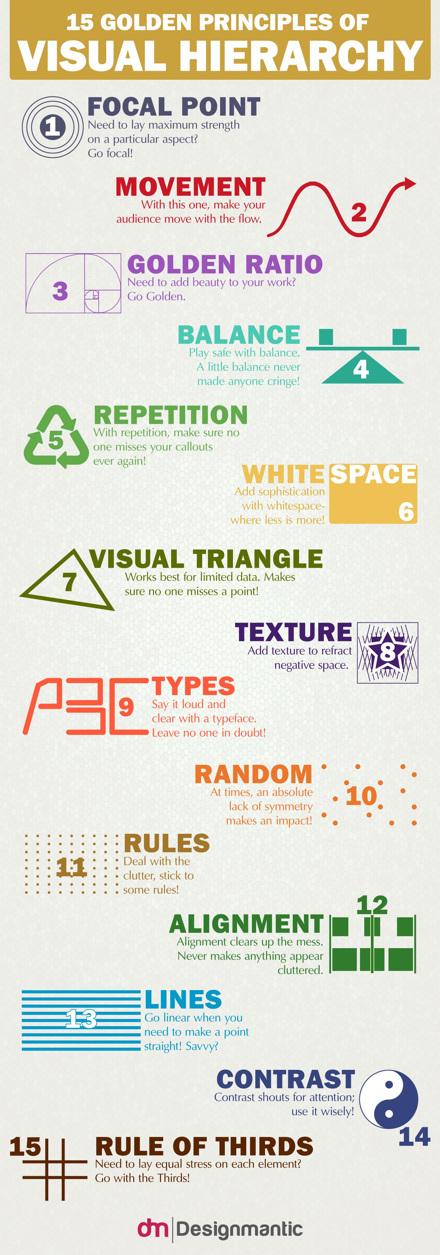
Understanding how to visually structure a page can transform the way users interact with a website. Visual hierarchy helps to prioritize information, ensuring that critical content captures attention first. Designers can utilize various techniques to create a more intuitive experience, such as:
- Size and Scale: Larger elements naturally attract the eye and can signify importance.
- Color Contrast: Bold colors can differentiate sections, guiding users to key areas.
- Whitespace: Adequate spacing can enhance readability and allow users to focus on primary actions.
When users land on a site, their eyes instinctively search for the navigation that will guide their journey. By arranging components effectively, websites can enhance usability and reduce cognitive load. A clear visual hierarchy not only makes navigation intuitive but also instills a sense of trust and professionalism. Consider the following table as a quick reference for designing your site’s navigation:
| Element | Purpose |
|---|---|
| Navigation Bar | Establishes primary pathways for users. |
| Call to Action (CTA) Buttons | Encourages specific actions, like signing up or purchasing. |
| Headings and Subheadings | Organizes content, making it scannable and digestible. |

Testing and Iterating: Refining Navigation Through Feedback
In the pursuit of seamless user experience, gathering input from your audience is paramount. User feedback acts as a compass, guiding designers towards areas that require adjustment. To effectively refine navigation, consider implementing the following methods to solicit insights:
- User Testing: Observing real users as they interact with your site can unveil hidden challenges.
- Survey Tools: Utilize short, targeted surveys to collect actionable feedback directly from visitors.
- A/B Testing: Experiment with different navigation layouts to gauge user preferences and engagement.
Once feedback is collected, the next step is to analyze and iterate based on findings. Structuring your approach can greatly enhance this process. Consider utilizing a simple table to track feedback and changes made:
| Feedback Source | Issue Identified | Proposed Solution |
|---|---|---|
| User Testing | Difficulty finding the contact page | Add a clearly labeled contact link in the main menu |
| Survey | Too many submenu items | Consolidate categories and simplify the navigation structure |
| A/B Testing | Low engagement on the help section | Redesign help section with clearer, more engaging visuals |
By creating a systematic approach to integrating feedback, site owners can ensure that their navigation evolves alongside user needs, resulting in a more intuitive and satisfying browsing experience.
Wrapping Up
the art of creating intuitive website navigation emerges as a cornerstone of effective web design, bridging the gap between user intent and seamless interaction. As we’ve explored, a thoughtfully designed navigation system serves not only as a roadmap through digital landscapes but also enhances user satisfaction and boosts engagement. By prioritizing clarity, consistency, and user-centric principles, designers can transform potential frustration into fluid experiences.
As you embark on your own navigation design journey, remember that the goal is not just to guide users but to invite them into a space where exploration feels natural and rewarding. With each click, every menu item, and all the pathways you craft, you’re sculpting a dynamic narrative—one that welcomes users to discover, engage, and return. Embrace the principles of intuitive design, and let your website guide its visitors toward meaningful interactions and memorable experiences.
