Unlocking the Benefits: Why Dark Mode Is Here to Stay!
The Rise of Dark Mode: A Shift in Digital Interaction
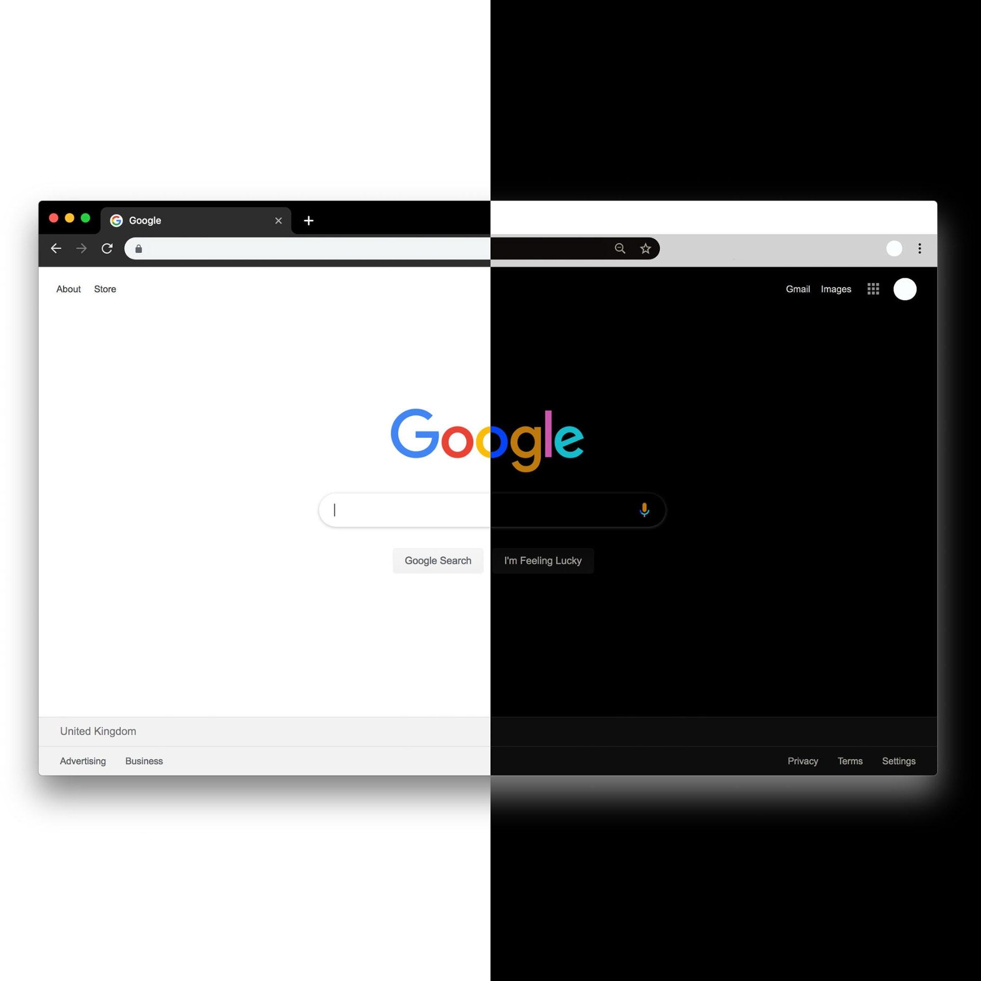
In the past few years, dark mode has gained significant traction, captivating both tech aficionados and everyday users. Once thought to be a simple design preference, this modern interface has ignited discussions surrounding usability, eye health, and overall digital well-being. What is the deeper significance of this popular feature? As more platforms adopt dark mode, it becomes evident that this trend is not just a passing phase; rather, it signifies our changing dynamics with technology. This article explores why adopting dark mode represents more than just a temporary trend—it’s an innovative approach that enhances our digital experiences and interactions with screens.
Contents Overview
- The Science of Dark Mode: Visual Comfort Explained
- Practical Benefits: How Dark Mode Enhances Battery Life
- Dark Mode and Productivity: Fostering Focus and Concentration
- Future Design Trends: The Role of Dark Mode in User Interfaces
- Conclusion: Embracing the Shift to Dark Mode

The Science of Dark Mode: Visual Comfort Explained
Dark mode transcends being merely a fashionable choice; it is rooted in both aesthetic appeal and scientific principles. The high-contrast visuals attract many users for good reason—there are substantial benefits behind its rising popularity. One key advantage is its ability to significantly reduce eye strain in dimly lit settings. By minimizing glare from screens, dark mode offers relief for those who spend long hours reading or browsing online.
Moreover, color perception plays an essential role; darker backgrounds highlight lighter text effectively, enhancing readability while improving visual clarity. As screen usage continues to dominate our work and leisure activities, ensuring a comfortable viewing experience becomes increasingly important.
The psychological effects associated with darker themes should also be acknowledged. Many individuals report feeling calmer and more focused when using dark mode due to the softer light emitted by screens compared to bright white backgrounds. This combination of soothing aesthetics alongside functional advantages encourages prolonged engagement with content. Key attributes contributing to its appeal include:
- Aesthetic Cohesion: Creates a unified design experience.
- Energy Conservation: Extends battery life on OLED displays.
- Accessibility: Beneficial for users with visual challenges.

Practical Benefits: How Dark Mode Enhances Battery Life
The advantages of dark mode extend beyond mere aesthetics; they encompass practical benefits that significantly improve user experience—especially regarding battery longevity. This efficiency stems from how OLED (Organic Light Emitting Diode) displays function; these screens consume less power when displaying darker colors since they do not need to activate pixels fully for black tones. Consequently, utilizing dark mode can lead to notable energy savings for heavy device users who may notice improved battery performance over time.
Beyond extending battery life, dark mode also enhances readability under low-light conditions by reducing contrast between the screen’s brightness and ambient light levels—making extended viewing sessions much more comfortable on the eyes as well as beneficial during nighttime use or dim environments.
- Lesser Eye Strain: Softer contrasts help maintain visual comfort over time.
- Diminished Blue Light Exposure: Reduced blue light can positively impact sleep quality at night.
- Sustained Device Usage: Longer intervals between charges enhance productivity levels throughout daily tasks.
The integration of dark mode ultimately results in an enhanced user-friendly experience that combines functionality with personal preferences—a clear indication that this trend goes far beyond superficial visual appeal alone!

Dark Mode and Productivity: Fostering Focus and Concentration
As we navigate through our digital landscapes today ,darkmode has emerged as revolutionary tool transforming how we engage within these environments .One major factor driving this change lies within its capacity reduce eye fatigue especially during lengthy periods spent staring at screens .Switching over into darker interfaces softens contrast between text & background making reading easier without causing discomfort .Additionally ,the gentle illumination provided by devices operating under “dark” settings promotes greater overall comfort which leads towards increased focus levels allowing individuals immerse themselves deeply into their tasks free from distractions caused by harsh lighting conditions .
< p >Furthermore ,the psychological implications tied directly back towards utilizing such themes extends far beyond mere physical ease ;it cultivates atmosphere conducive creativity & concentration alike !Research indicates implementing darker interfaces fosters sense calmness thereby aiding retention cognitive performance while working through various projects simultaneously! Moreover aesthetically pleasing nature inherent within these designs makes them engaging leading towards :
< ul >
< / ul >

Future Design Trends : The Role Of User Interfaces With DARK MODE
< p > In today’s rapidly evolving design landscape ,darkmode quickly establishes itself staple rather than fleeting fad !As preferences shift toward prioritizing visual comfort ,benefits associated become increasingly apparent ;not only does it alleviate strain experienced under low-light conditions but also optimizes energy consumption across OLED displays too!Sleek aesthetics impart modern elegance applications websites alike making adoption necessary forward-thinking designs moving forward !With accessibility remaining critical factor here too -this feature proves invaluable providing inclusive experiences those facing challenges related vision impairments!
< / p >
< p >Implementing effective strategies around incorporating such modes requires understanding interplay colors psychology behind engagement itself successfully executed implementations often showcase :
< / p >
- < strong > Subtle contrasts guiding attention without overwhelming viewers
- < strong > Strategic accent hues popping against deeper shades emphasizing key elements
- < strong > Clear typography choices ensuring legibility enhancing overall user satisfaction
< / ul >Advantages > > > >
tr/>
tbody/>
table/>Conclusion : Embracing The Shift To DARK MODE
- < strong > Strategic accent hues popping against deeper shades emphasizing key elements
