Why Great Design Starts with Simplicity
In a world brimming with complexity—where technology whirs, information floods, and choices multiply—one might wonder if simplicity can still be an architect of great design. Yet, as the adage reminds us, “less is more.” This seemingly modest philosophy invites us to peel back the layers of excess and noise, revealing the beauty and efficacy that lie at the heart of simplicity. Great design, in its purest form, transcends mere aesthetics; it harmonizes function and form, creating experiences that resonate deeply with users. As we embark on an exploration of why great design begins with simplicity, we’ll uncover the principles that make simplicity not just a design choice, but a strategic foundation for creativity and innovation. Join us as we delve into the art of distillation—where clarity and elegance become the guiding stars of impactful design.
Table of Contents
- The Power of Minimalism in Design
- Understanding User Experience Through Simplicity
- Balancing Aesthetics and Functionality
- Strategies for Embracing Simplicity in Your Projects
- Closing Remarks

The Power of Minimalism in Design
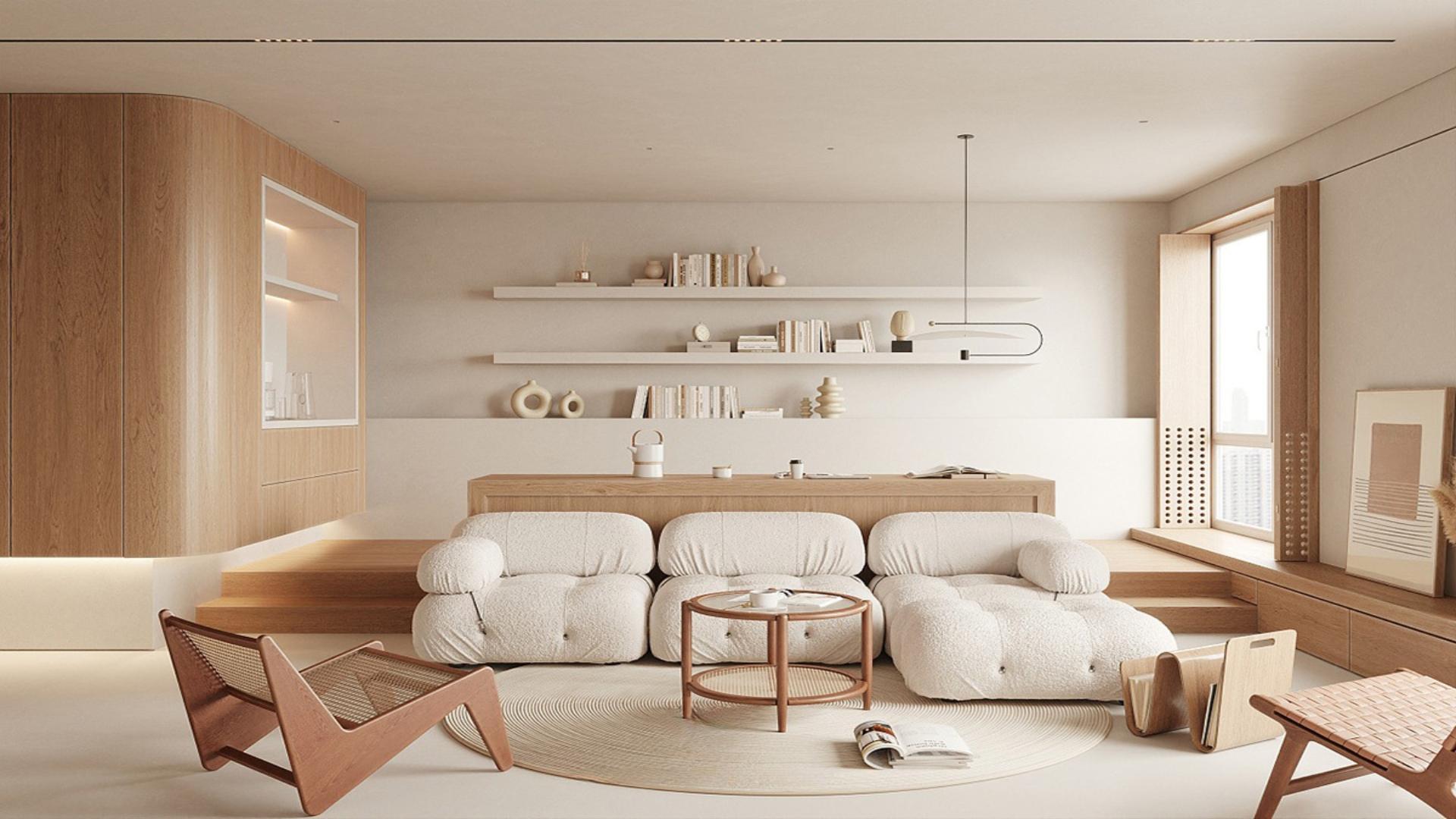
In the realm of design, the adage “less is more” reigns supreme, emphasizing the importance of stripping away the non-essential to reveal the essence of an idea. Minimalism promotes clarity and focus, allowing users to engage with the intended message without distraction. Consider the following elements that embody the power of simplicity:
- White Space: Breathing room provides balance and enhances comprehension.
- Limited Color Palette: Fewer colors create unity and stronger emotional connections.
- Clear Typography: Simple fonts improve readability and accessibility.
When a design embraces minimalism, it often leads to increased functionality and improved user experience. Designs that prioritize straightforward navigation and intuitive layouts guide users effortlessly through content. A well-structured table can serve as an excellent representation of minimalist design principles:
| Element | Benefit |
|---|---|
| Icons | Instant recognition and understanding |
| Simple Layouts | Reduced cognitive load |
| Consistent Branding | Stronger identity and recall |

Understanding User Experience Through Simplicity
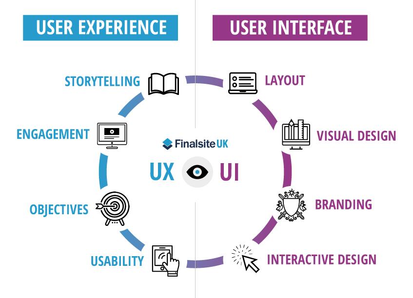
In the realm of design, simplicity serves as the cornerstone of effective user experience. When interfaces are stripped of unnecessary clutter, users can navigate with ease and focus on what truly matters. This doesn’t just enhance usability, it fosters a sense of trust and familiarity. Essential elements should be highlighted while less critical features take a backseat, ensuring that every interaction feels intuitive and fluid. Consider these key attributes of a simplistic design:
- Clarity: Clear labels and concise information help users understand without overwhelming them.
- Consistency: Uniformity across design elements nurtures familiarity and ease of use.
- Functionality: Every feature should have a purpose; anything extraneous can dilute the user experience.
Moreover, simplicity is not synonymous with minimalism; rather, it transforms complexity into an engaging experience. By prioritizing core functionalities and presenting information in manageable chunks, designers can lead users seamlessly through their journey. Analyzing user behavior can reveal insights into what elements truly resonate, allowing for a tailored approach. Consider the following table that highlights user preferences based on design elements:
| User Preference | Impact Level |
|---|---|
| Simple Navigation | High |
| Clear Call-to-Action | Very High |
| Visual Hierarchy | Moderate |

Balancing Aesthetics and Functionality
The harmony between aesthetics and functionality is a delicate dance that defines the essence of great design. When a design is visually appealing, it draws the eye and sparks interest, but if it lacks practicality, it fails to serve its intended purpose. On the other hand, a purely functional design may excel in utility yet often misses the critical element of charm that makes it memorable. To achieve a balance, designers can focus on integrating the following principles:
- Unified Color Palettes: Choosing colors that enhance both mood and usability.
- Intuitive Layouts: Organizing elements in a way that aligns with natural user behavior.
- Adaptive Elements: Crafting designs that remain visually engaging while maintaining ease of use.
An effective way to illustrate this balance is by comparing different design approaches. Here’s a simple overview:
| Design Approach | Aesthetic Quality | Functional Capability |
|---|---|---|
| Minimalist Design | High – Clean lines and ample white space. | High – Streamlined for user efficiency. |
| Ornate Design | Very High – Rich details and textures. | Medium – Can overwhelm the user experience. |
| Modernist Design | High – Boldness and innovation. | High - Seamless integration with technology. |

Strategies for Embracing Simplicity in Your Projects
Embracing simplicity in design begins with a clear understanding of the project’s core objectives. Focus on the purpose of your project and strip away any unnecessary elements that may detract from it. Create a mind map to visualize the relationships between ideas and identify what truly matters. This helps in prioritizing features and breaking down complex tasks into manageable components. Consider the following methods to streamline your approach:
- Define Your Audience: Know who you are designing for, and tailor your project to their needs.
- Limit Your Color Palette: Use a few harmonious colors to enhance visual clarity.
- Utilize White Space: Allow your design to breathe by incorporating ample spacing between elements.
- Iterate, Don’t Overcomplicate: Focus on refining design elements rather than adding new, complex features.
Another effective strategy is to leverage prototyping and feedback loops to fine-tune your design iteratively. Start with a low-fidelity prototype that concentrates on core functionalities, allowing users to engage with the project’s essence. Gather constructive feedback early on, and use this insight to simplify and enhance the design continuously. Here’s a simple table showcasing the steps of an iterative design process:
| Step | Description |
|---|---|
| 1. Ideation | Generate ideas that resonate with your audience. |
| 2. Design | Create a low-fidelity prototype focusing on key features. |
| 3. Feedback | Collect user feedback to identify pain points and areas for improvement. |
| 4. Iterate | Refine your design based on the feedback received. |
Closing Remarks
In a world that’s constantly pushing the boundaries of complexity, it’s refreshing to remember the timeless power of simplicity. As we’ve explored, great design is not merely about aesthetic appeal; it’s about clarity, functionality, and the ability to connect with users on a fundamental level. By embracing simplicity, designers can declutter the noise that often surrounds their work, allowing their creations to resonate more effectively with their intended audience.
As we move forward in this era of rapid technological advancement and shifting consumer expectations, let us not lose sight of the essential principle that less is often more. Whether you’re a seasoned designer, an aspiring creative, or simply someone with an appreciation for thoughtful design, consider how simplicity can serve as your guiding star.
After all, the most memorable designs are often the ones that invite us to pause, reflect, and appreciate the beauty in straightforwardness. So, as you embark on your own design journey, remember: great design starts with simplicity, and within that simplicity lies the potential for innovation and profound impact.
