How to Avoid Common Website Design Pitfalls
In the vast digital landscape, a website serves as the very storefront of a brand—its first impression, its calling card, and often, its best chance to captivate an audience. Yet, as designers embark on the intricate journey of crafting an online presence, many stumble into familiar traps that can undermine their vision and frustrate users. From clashing colors to convoluted navigation, these common website design pitfalls can detract from the user experience and diminish the impact of even the most remarkable content. In this article, we will explore the critical missteps to avoid, offering insights and strategies to steer clear of these design dilemmas. Whether you’re a budding entrepreneur or a seasoned professional, mastering the art of website design is essential for creating a seamless, engaging, and effective online experience. Let’s dive into the essentials of building a captivating website that resonates with visitors from the moment they click “Enter.”
Table of Contents
- Identifying User Experience Traps That Deter Engagement
- Essential Design Principles for Seamless Navigation
- The Importance of Responsive Design in Todays Digital Landscape
- Effective Strategies for Optimizing Load Times and Performance
- Key Takeaways

Identifying User Experience Traps That Deter Engagement
As users navigate a website, their experience can quickly turn sour due to certain design missteps. Recognizing these pitfalls is crucial for maintaining engagement and encouraging positive interactions. Common traps include:
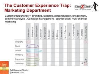
- Overly Complex Navigation: If users struggle to find essential information, they are likely to abandon the site. Clear, intuitive menus enhance usability.
- Excessive Pop-ups: Intrusive pop-ups can annoy visitors, disrupting their journey and leading to frustration.
- Poor Mobile Responsiveness: With growing mobile usage, a site that doesn’t function seamlessly on all devices risks losing a significant audience.
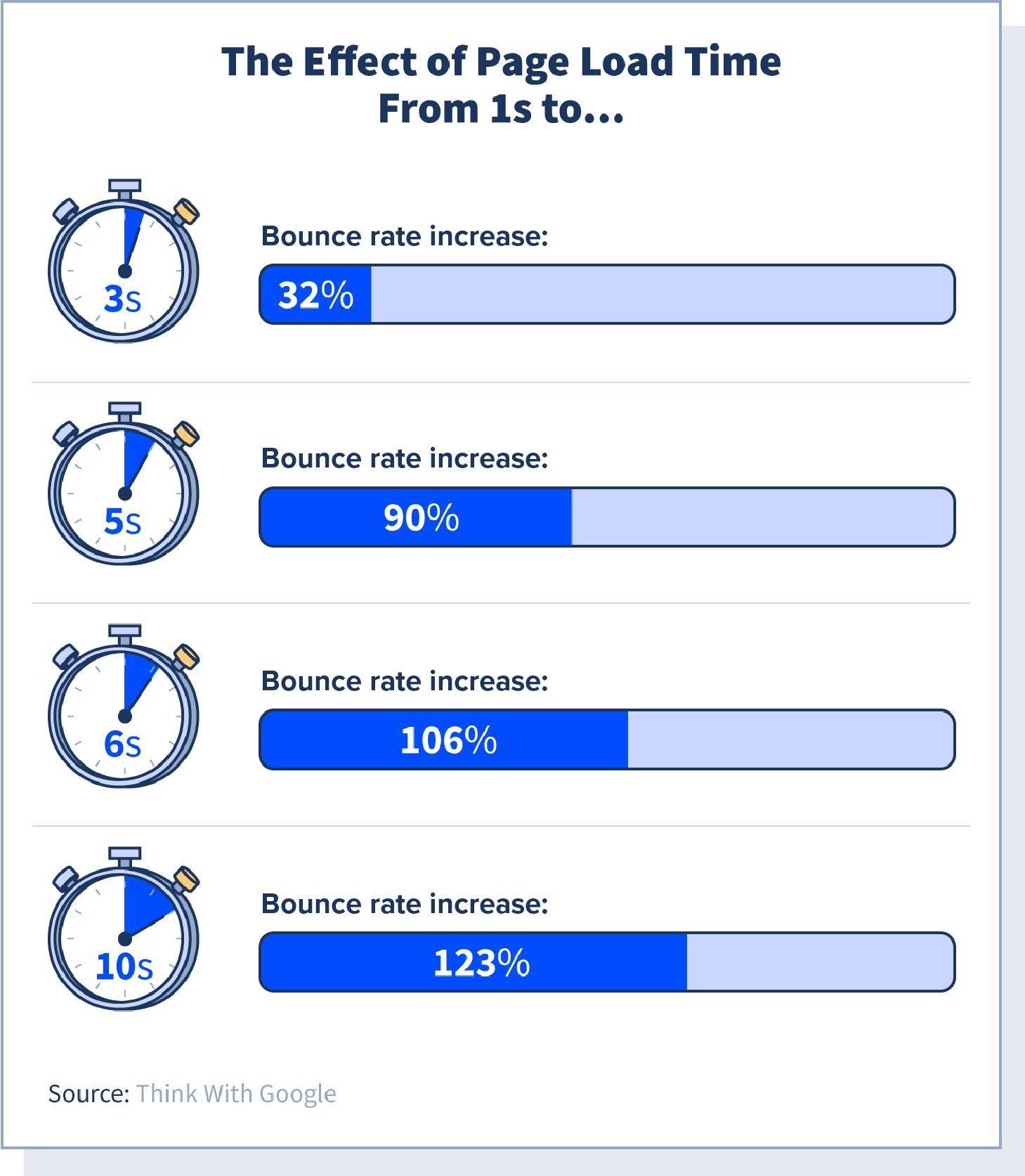
Another critical aspect is the website’s loading speed, which plays a pivotal role in user retention. If a site takes too long to load, potential customers may not stick around. Factors that contribute to slow loading times include:
| Factor | Impact |
|---|---|
| Large Image Files | Increases load time, leading to higher bounce rates. |
| Too Many Scripts | Can slow down page rendering, frustrating users. |
| Unoptimized Code | Hinders performance, affecting both speed and user experience. |
By addressing these factors, web designers can create an environment that promotes user engagement and encourages visitors to explore further.

Essential Design Principles for Seamless Navigation
Creating a seamless navigation experience is crucial to keeping users engaged and ensuring they can easily find what they’re looking for. To achieve this, focus on clarity and consistency in your menu structure. Each menu item should have a clear label, using familiar terminology that users can quickly understand. Employ visual hierarchies and logical groupings to guide users through your content intuitively. Furthermore, maintain a consistent navigation layout across different pages to eliminate confusion and enhance familiarity as users traverse your site.
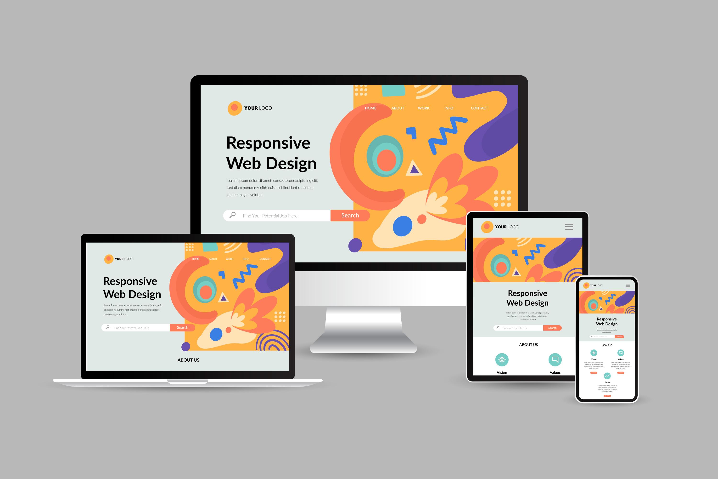
Another vital component is responsive design, which ensures that your navigation system works across various devices and screen sizes. Implementing a mobile-first approach can significantly boost usability, as many visitors will access your site through their smartphones. Consider using a hamburger menu on smaller screens to save space while still providing access to all critical links. Additionally, incorporating interactive elements like drop-downs and hover effects can enhance the user experience but ensure these elements are not overwhelming or complex to navigate.

The Importance of Responsive Design in Todays Digital Landscape
In an age where users access websites across a myriad of devices—from sleek smartphones to expansive desktops—ensuring your site is responsive is not just a nice-to-have; it’s a necessity. A responsive design adapts seamlessly to any screen size, providing an optimal viewing experience. This approach not only enhances user satisfaction but also plays a critical role in SEO rankings. Search engines like Google favor websites that deliver a cohesive experience across devices, thus improving your site’s visibility and driving organic traffic.
Consider the following key benefits of maintaining a responsive design:
- Improved User Experience: Users enjoy a consistent experience, reducing frustration and increasing engagement.
- Cost-Effectiveness: Rather than maintaining separate sites for desktop and mobile, a single responsive design cuts down on development and maintenance costs.
- Higher Conversion Rates: A well-optimized site encourages visitors to complete desired actions, whether it be filling out a form or making a purchase.
To further illustrate the impact of responsive design on user engagement, consider the following comparison:
| Device Type | Average Bounce Rate | Conversion Rate |
|---|---|---|
| Mobile | 70% | 1.5% |
| Tablet | 50% | 3% |
| Desktop | 38% | 5% |

Effective Strategies for Optimizing Load Times and Performance
To ensure a seamless user experience, it’s essential to implement effective strategies for load time and performance optimization. Start by minimizing the size of your files; this can be achieved by compressing images and utilizing modern formats like WebP that retain quality while reducing file size. Lazy loading is another powerful technique, allowing images and videos to load only when they are needed, which significantly cuts down the initial loading time. Additionally, using a content delivery network (CDN) helps distribute your site’s content across various geographic locations, reducing latency for users around the globe.
Furthermore, managing your website’s resources and leveraging browser caching can dramatically enhance performance. Ensure that you are using asynchronous loading for non-essential scripts, which allows the main content to be displayed without being blocked by JavaScript files. Regularly audit your website’s plugins; unnecessary or outdated plugins can slow your site down. Consider using the following table to identify solutions to common performance issues:
| Issue | Solution |
|---|---|
| Large images | Compress and convert to WebP format |
| Excessive plugins | Regularly audit and remove unnecessary plugins |
| Slow server response | Consider a reliable hosting provider |
| Render-blocking resources | Use asynchronous loading for scripts |
Key Takeaways
In the ever-evolving digital landscape, mastering the art of website design is crucial for anyone looking to make a lasting impression online. As we’ve explored throughout this article, steering clear of common design pitfalls can not only enhance user experience but also elevate your brand’s presence in the crowded virtual marketplace. Remember, thoughtful design is a blend of aesthetics and functionality, a dance where every element plays its part.
As you embark on your website design journey, keep these insights close at hand. From ensuring intuitive navigation to embracing responsive design, each choice you make builds towards an engaging and memorable user experience. Take a moment to step back, evaluate your existing designs, and apply these principles. By doing so, you can transform potential stumbling blocks into stepping stones, paving the way for your site to flourish.
Designing a website is not merely about creating a pretty facade; it’s about engineering an experience that resonates with your audience. So, stay curious, keep learning, and don’t hesitate to iterate. The path to a stunning and effective website is ongoing, filled with opportunities for innovation and growth. Happy designing!
