Layered Designs: Creating Depth on a Flat Screen
In a world increasingly captivated by visual storytelling, the art of design often hinges on the ability to transform a flat canvas into a captivating landscape of depth and dimension. “Layered Designs: Creating Depth on a Flat Screen” invites you to explore the techniques and principles that breathe life into the seemingly two-dimensional realm of digital graphics. While screens may be flat, the possibilities for creating rich, immersive experiences are anything but. From intricate layering of textures and tones to the strategic use of shadows and light, this article delves into the nuances of layered design—a practice that balances creativity with technical skill. Join us as we unravel the secrets behind crafting visuals that not only catch the eye but also resonate with the viewer on multiple levels, inviting them to engage with a story that unfolds beyond the surface.
Table of Contents
- Exploring the Foundations of Layered Design Principles
- Balancing Color and Texture for Enhanced Visual Impact
- Utilizing Shadows and Highlights to Elevate Flat Surfaces
- Crafting Engaging User Experiences through Depth and Dimension
- In Conclusion

Exploring the Foundations of Layered Design Principles
At the heart of layered design is the concept of building visual and functional depth, which transforms a flat surface into an engaging experience. By strategically employing contrast, texture, and transparency, designers can create a sense of dimension that captivates users. Key principles to consider include:
- Hierarchy: Establishing levels of importance through colors and sizes.
- Overlap: Utilizing elements that cross paths to suggest depth.
- Shadows: Adding subtle shadows for a three-dimensional feel.
An effective layered design doesn’t merely focus on appearance but also enhances usability. Navigation elements, content blocks, and interactive features should all reflect this concept. A well-thought-out layout can improve user engagement significantly. Here are some essential components to incorporate:
| Component | Function |
|---|---|
| Background Layers | Sets the mood and tone for the interface. |
| Content Blocks | Organizes information in digestible sections. |
| Interactive Elements | Encourages user interaction and engagement. |

Balancing Color and Texture for Enhanced Visual Impact
Creating visually appealing designs requires a keen understanding of how color and texture interrelate to shape perceptions. When used effectively in layered designs, color can serve as both a unifying and distinguishing factor, while texture adds nuance and character. To achieve an impactful balance, consider these elements:
- Color Harmony: Use complementary and analogous color schemes to create a cohesive look.
- Texture Contrasts: Incorporate smooth, glossy textures alongside rough, matte finishes to draw the eye and create interest.
- Layering Techniques: Experiment with overlays and transparency to allow colors and textures to interact dynamically.
Color not only enhances visual appeal but also evokes emotions. By selecting a palette that resonates with the intended message, you can enhance engagement. Each color can be paired with a specific texture to deepen the viewer’s experience, such as:
| Color | Texture | Emotional Impact |
|---|---|---|
| Blue | Soft Fabric | Calmness |
| Orange | Rough Stone | Energetic |
| Green | Wood Grain | Nature |
By thoughtfully integrating these components, you can elevate layered designs from flat visuals to captivating experiences, encouraging interaction and stronger connections with the audience.

Utilizing Shadows and Highlights to Elevate Flat Surfaces
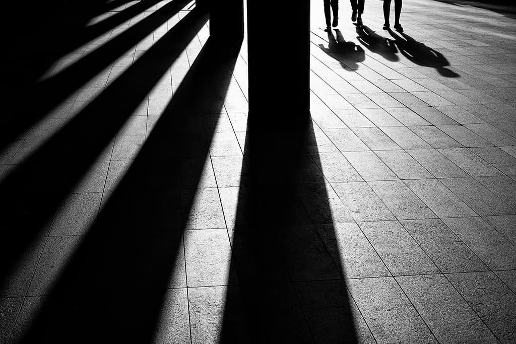
When designing layered visuals on flat surfaces, the interplay of shadows and highlights can transform a two-dimensional space into a rich, multidimensional experience. By strategically placing shadows beneath objects, designers can simulate depth, creating the illusion of weight and presence. Key techniques include:
- Using Soft Edges: Gradually transitioning from light to shadow can create a more realistic effect.
- Color Tone Variation: Consider incorporating darker hues for shadows and lighter tones for highlights.
- Layering Techniques: Overlapping elements with varying depths allows for an engaging visual flow.
On the flip side, highlights serve to accentuate and draw attention to specific areas of a design. A well-placed highlight can not only emphasize detail but also guide the viewer’s eye throughout the composition. To effectively use highlights, keep in mind:
| Technique | Effect |
|---|---|
| High Contrast | Creates a dramatic focal point. |
| Subtle Gradients | Provides a sense of smooth transition. |
| Reflective Surfaces | Enhances realism and depth. |
By mastering these elements, designers can bring flat surfaces to life, guiding perception and interaction through careful manipulation of light and dark. These techniques not only engage the viewer but also provide a sense of immersion, ensuring that flat designs resonate more deeply.

Crafting Engaging User Experiences through Depth and Dimension
In today’s digital landscape, transforming flat screens into engaging, immersive experiences relies heavily on the strategic use of depth and dimension. Designers can breathe life into their creations by layering elements in a way that captivates users. Shadows, overlays, and translucent textures invite viewers to explore different facets of a design, creating an illusion of space that defies the restrictions of a 2D platform. By incorporating these techniques, one can guide the user’s gaze, creating a visual hierarchy that enhances storytelling and interaction.
Consider the following techniques that can significantly elevate the user experience:
- Parallax Scrolling: This technique allows background elements to move slower than foreground elements, giving depth to scrolling pages.
- 3D Transitions: Using animations that reflect three-dimensional properties fosters an interactive environment.
- Layered Textures: Adding layers of textures can provide tactile sensations that enhance visual interest.
To illustrate the impact of these design strategies, the following table highlights key elements that contribute to a sense of depth:
| Element | Impact on User Experience |
|---|---|
| Shadows | Create visual separation and dimension. |
| Opacity | Enhances layering and visual depth. |
| Contrast | Draws attention and establishes focal points. |
In Conclusion
In the ever-evolving landscape of digital design, the quest for depth on a flat screen continues to challenge and inspire creatives worldwide. As we have explored in this article, layered designs not only enhance visual appeal but also invite users into an immersive journey, transforming static interfaces into dynamic experiences. By thoughtfully integrating elements of depth, texture, and perspective, designers can evoke emotions, guide narratives, and foster interaction in ways previously thought impossible on a two-dimensional plane.
As you embark on your own design adventures, remember that the art of layering is not merely a technique, but a powerful storytelling tool. Experiment with contrasts and harmonies, invite viewers to look beyond the surface, and let your designs resonate with the complexity that reflects the world around us. In the realm of the digital canvas, depth is not just an illusion; it is an invitation to explore. So, dive into your next project with curiosity and creativity, and watch as your flat screen blossoms into a vibrant tapestry of layered wonder.
