Bold Typography: Making a Statement Online
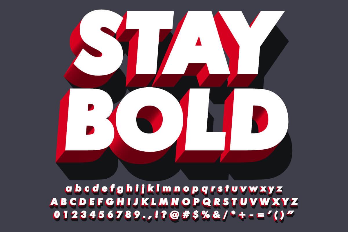
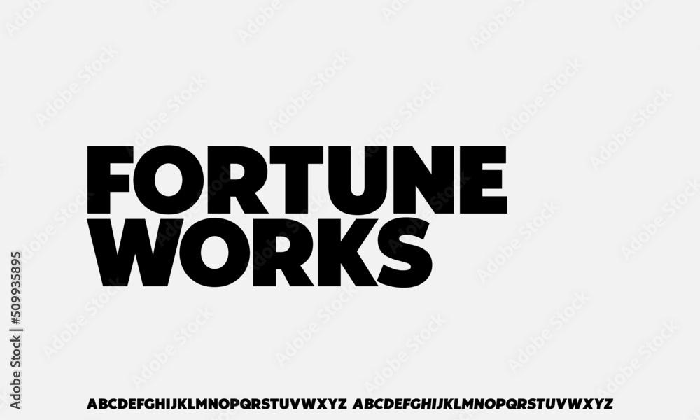
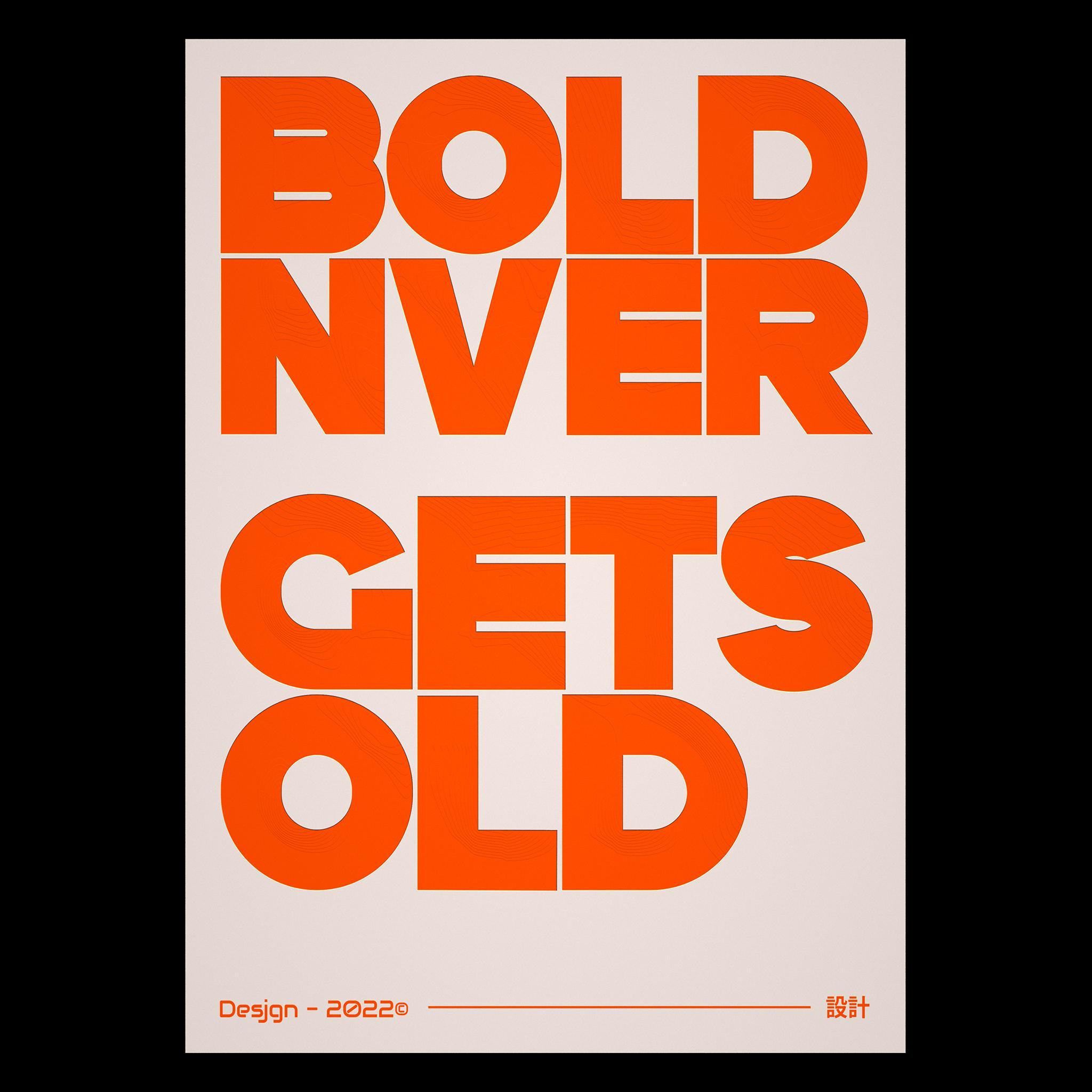
In the vast expanse of the digital landscape, where information bombards the senses from every angle, the art of typography emerges as a crucial player in capturing attention and conveying messages. Bold typography, with its striking prominence and unapologetic presence, transcends mere words to become a visual hero in online communication. It beckons to be noticed, inviting readers to pause in a hurried world where print often fades into the background. This article delves into the dynamics of bold typography, exploring how its deliberate choices can elevate designs, enhance user experience, and ultimately make an indelible statement in the digital realm. Join us as we unravel the power of bold lettering—the tool that not only defines aesthetics but also shapes narratives in the online universe.
Table of Contents
- Exploring the Psychology of Bold Typography in Digital Design
- Choosing the Right Fonts: Balancing Aesthetics and Readability
- Implementing Bold Typography: Best Practices and Techniques
- Case Studies of Brands that Successfully Utilize Bold Typography
- To Wrap It Up

Exploring the Psychology of Bold Typography in Digital Design
When it comes to digital design, typography transcends mere aesthetics; it serves as a powerful communication tool. Bold typography captures attention and evokes emotions, shaping the viewer’s perception of content. This stylistic choice signals authority and confidence, enticing users to engage with the material. A few key aspects contribute to the psychological impact of bold text:
- Hierarchy: Establishes importance and guides the reader’s journey through content.
- Readability: Enhances clarity, making information easier to digest.
- Emphasis: Highlights critical information, ensuring it stands out.
Moreover, the use of bold fonts can significantly influence brand identity and user experience. It fosters a sense of familiarity and trust, encouraging interaction and loyalty among users. Here’s a quick overview of how different fonts might affect user perception:
| Font Style | Psychological Impact |
|---|---|
| Sans-serif | Modern and clean, suggests innovation. |
| Serif | Traditional and reliable, conveys professionalism. |
| Display | Unique and expressive, creates a strong emotional response. |

Choosing the Right Fonts: Balancing Aesthetics and Readability
When it comes to selecting fonts for your online content, striking the right balance between aesthetics and readability is crucial. Bold typography can create a strong presence, but it should not come at the expense of the audience’s ability to engage with your material. Consider the following elements when choosing your fonts:
- Font Size: Ensure that your text is large enough to be legible across various devices.
- Contrast: Use contrasting colors for text and background to enhance visibility.
- Line Spacing: Adequate spacing between lines helps prevent reader fatigue.
- Font Pairing: Select complementary fonts to create a hierarchy that guides the reader’s eye.
To further illustrate your choices, here’s a simple guide comparing different font styles and their potential applications:
| Font Style | Aesthetic Appeal | Readability | Usage |
|---|---|---|---|
| Serif | Traditional, Elegant | High | Blogs, Articles |
| Sans-Serif | Modern, Clean | Very High | Websites, Headers |
| Display | Bold, Unique | Variable | Posters, Highlights |
By thoughtfully considering these factors, you can enhance the impact of your content while ensuring that it remains approachable and inviting, engaging readers effectively with your bold typographic choices.

Implementing Bold Typography: Best Practices and Techniques
When incorporating bold typography into your digital design, it’s essential to strike the right balance between readability and impact. Choose typefaces that not only stand out but are also legible across different devices. This ensures your message is communicated effectively. Utilization of white space around bold text can enhance its visibility and draw attention to key areas, preventing your design from feeling cluttered. Additionally, contrast is key; using bold type on lighter backgrounds or with opposite color schemes can create visual interest and hierarchy, guiding the reader through your content seamlessly.
Consider the following techniques to maximize the impact of bold typography:
- Hierarchy and Emphasis: Use bold type to highlight headings and important points.
- Consistent Style: Stick to a limited number of fonts to maintain coherence.
- Effective Pairing: Experiment with pairing bold fonts with lighter or contrasting fonts for balance.
- Limit Overuse: Use bold sparingly to ensure it remains impactful and does not overwhelm the reader.
| Technique | Benefit |
|---|---|
| Headings in Bold | Improves readability and guides hierarchy |
| Contrast Usage | Increases focus and engagement |
| Whitespace Management | Enhances navigation and reduces clutter |

Case Studies of Brands that Successfully Utilize Bold Typography
Airbnb has become a case study in how bold typography can transform brand identity. By using large, striking typefaces in their marketing materials and website, they capture attention and convey a sense of adventure. The combination of bold fonts and vibrant imagery creates an emotional connection with potential travelers, encouraging them to explore the world through Airbnb’s lens. Their use of white space alongside bold text also ensures clarity, allowing important information to shine through without overwhelming the viewer.
Another brand that demonstrates the effectiveness of bold typography is Spotify. Their distinctive use of oversized type not only reflects the dynamism of the music they represent but also emphasizes key messages and user experiences. The vibrant colors paired with bold lettering serve to energize the audience and create a sense of immediacy and excitement. This approach is particularly evident in their promotional campaigns, where typography acts as a visual anchor, guiding users toward new and featured playlists.
| Brand | Typography Style | Impact |
|---|---|---|
| Airbnb | Large Typeface, High Contrast | Engaging Emotional Connection |
| Spotify | Oversized, Vibrant Colors | Enhanced User Energy & Excitement |
To Wrap It Up
As we conclude our exploration of bold typography, it’s clear that the written word can be more than just a means of communication; it can be an art form that resonates with emotion and intention. In a world inundated with visual stimuli, striking typefaces serve not only to capture attention but also to convey personality and purpose. By embracing bold typography, designers can transform the mundane into the memorable, inviting viewers to pause, reflect, and engage.
Whether you’re designing a website, crafting a social media post, or curating a digital campaign, the choices you make in typography are pivotal. They can elevate your message, create harmony within your design, and ultimately resonate with your audience on a deeper level. So the next time you sit down to create, remember: the power of bold typography isn’t just about making a statement—it’s about crafting an experience that lingers long after the screen fades to black. Explore, experiment, and let your words shine with confidence.
