Transforming the Web: A Journey from Basic to Beautiful
Transforming the Web: A Journey from Basic to Beautiful
In the boundless realm of the internet, where lines of code weave a tapestry of interconnected ideas and experiences, the evolution of web design stands as a testament to human creativity and technological advancement. What once began as a pragmatic collection of text and hyperlinks has blossomed into a vibrant showcase of visual artistry and user-centered innovation. This article embarks on a journey through the transformation of the web—charting a course from its humble beginnings to the stunning, interactive landscapes we navigate today. As we explore the pivotal moments, emerging trends, and the minds behind this revolution, we’ll discover how aesthetics and functionality intertwine to create not just websites, but immersive experiences that resonate with users around the globe. Join us as we delve into the metamorphosis of digital spaces, celebrating the beauty that has redefined how we connect, learn, and engage on the world-wide web.
Table of Contents
- Embracing Design Principles for a User-Centric Experience
- The Power of Color and Typography in Web Aesthetics
- Enhancing Functionality with Responsive and Interactive Elements
- Crafting Content that Captivates and Engages Users
- Closing Remarks

Embracing Design Principles for a User-Centric Experience
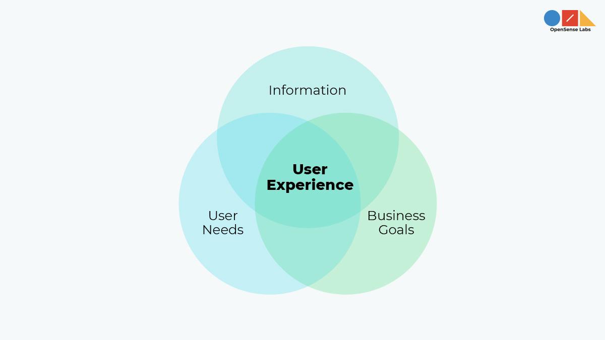
To create a truly captivating web experience, it’s essential to weave design principles into the fabric of our digital landscape. By prioritizing user-centricity, we enable visitors to seamlessly navigate and engage with our content. Consistency in layout and navigation fosters a sense of familiarity, allowing users to feel at home as they explore. Additionally, utilizing visual hierarchy ensures that the most critical elements catch the eye first, guiding users naturally through our offerings. Here are some key attributes that contribute to an engaging design:
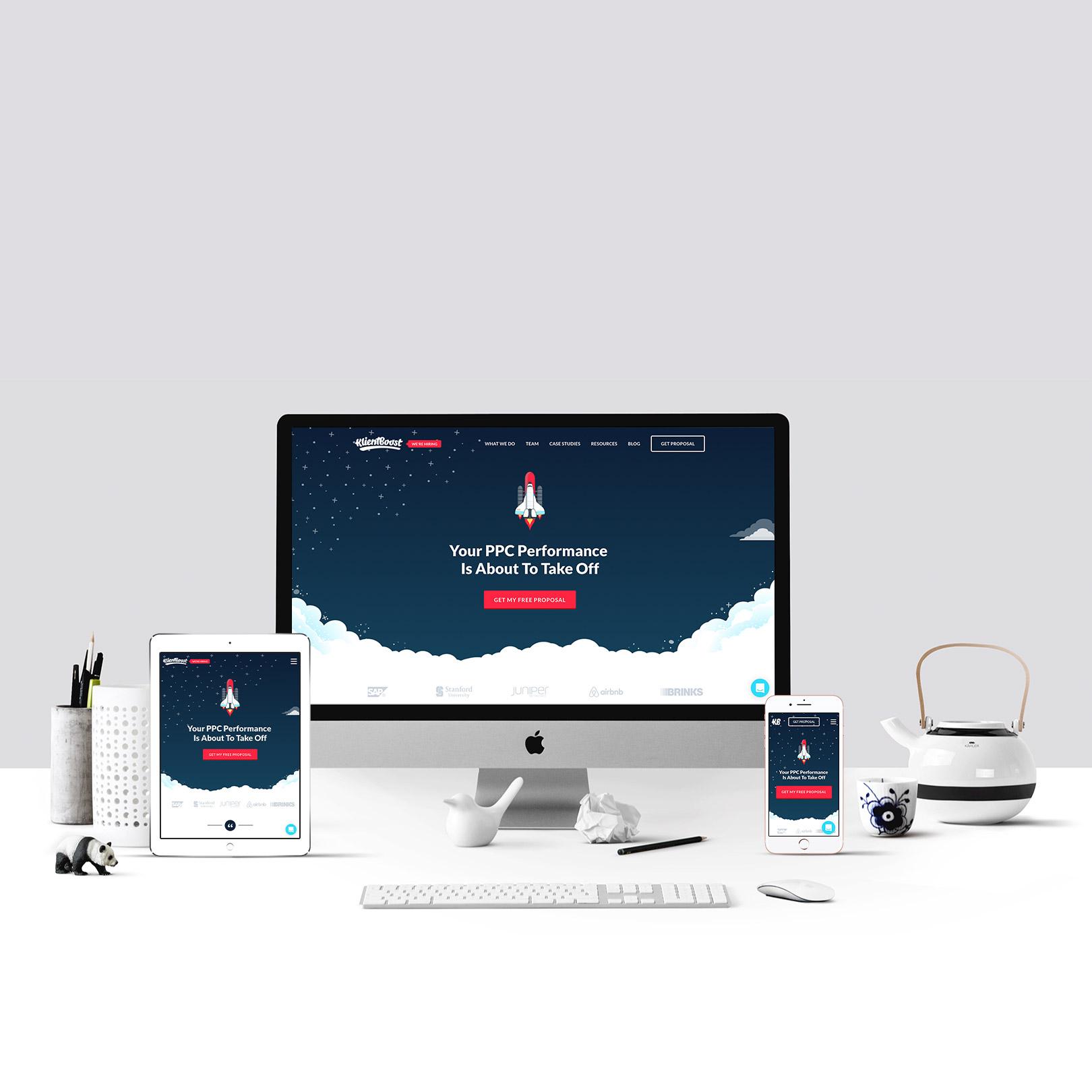
- Responsive Design: Ensures optimal viewing across devices.
- Clear Typography: Facilitates readability and enhances user comprehension.
- Intuitive Navigation: Simplifies the journey to necessary information.
- Accessible Color Schemes: Accommodates users with diverse visual needs.
Incorporating these principles leads to a website where users feel valued and understood. The approach should also include establishing a feedback loop, allowing us to gather insights directly from our audience. This iterative process not only enhances user satisfaction but also keeps the design evolving. To further illustrate the impact of design choices, consider the following comparison of engagement metrics before and after implementing user-focused strategies:
| Design Phase | Page Views | Average Time on Site | Bounce Rate |
|---|---|---|---|
| Before Redesign | 1,000 | 1:30 mins | 65% |
| After Redesign | 2,500 | 3:15 mins | 35% |

The Power of Color and Typography in Web Aesthetics
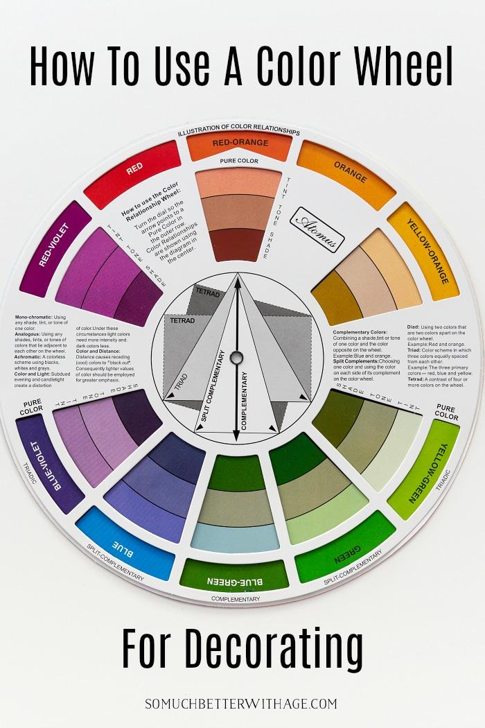
The visual language of a website is often dictated by its color palette and typography, elements that play a crucial role in shaping user perception and experience. Colors evoke emotions and can lead to spontaneous decisions, making it essential to select hues that align with the underlying message of the site. Consider these key aspects when choosing a color scheme:
- Contrast: Ensures that text is legible against background colors.
- Consistency: Maintains a unified look across all pages.
- Brand Identity: Reflects the personality of the brand, enhancing memorability.
The careful orchestration of colors strengthens the narrative of the web experience, leading visitors through an evocative journey.
In tandem with color, typography serves as the voice of the written content on a website. The right font selections not only enhance readability but also amplify the site’s character. When curating your typographic elements, consider the following factors:
- Hierarchy: Establishes a visual order, guiding users’ attention.
- Legibility: Ensures that text is easily read across devices.
- Font Pairing: Combines contrasting styles to create visual interest.
This harmonious blend can transform the mundane into the magnificent, ultimately redefining how users interact with your digital space.

Enhancing Functionality with Responsive and Interactive Elements
To captivate your audience, integrating responsive and interactive elements is essential. These features not only enhance user engagement but also create a seamless experience across various devices. Consider implementing the following:
- Responsive Navigation Menus: Ensure your menus adapt fluidly to different screen sizes, offering a consistent user experience.
- Dynamic Content Blocks: Use elements that change based on user interaction, keeping content fresh and engaging.
- Interactive Forms: Design forms that guide users with real-time validation and hints, making the data entry process more intuitive.
Incorporating these elements can drastically improve the functionality of your website. For instance, employing a responsive design framework, like Bootstrap, can streamline your development process while maintaining aesthetic appeal. Additionally, consider the benefits of using a simple table to convey important information efficiently:
| Element | Benefit | Implementation Tip |
|---|---|---|
| Responsive Images | Adapts to various screens | Use the srcset attribute |
| Hover Effects | Enhances user interaction | Utilize CSS transitions |
| Real-Time Updates | Keeps content current | Incorporate AJAX calls |

Crafting Content that Captivates and Engages Users
In the vast expanse of the digital realm, capturing the attention of users transcends mere aesthetics. Effective content creation hinges on the harmony between compelling narratives and visual allure. Striking the right balance can be achieved by focusing on the following key elements:
- Authenticity: Users connect with genuine stories that resonate with their own experiences.
- Relevance: Crafting content that aligns with current trends and user interests enhances engagement.
- Interactivity: Features such as quizzes, polls, and embedded multimedia foster dynamic user experiences.
By thoughtfully integrating these components, we can create a tapestry of information that is both informative and inviting, urging users to dive deeper into the content.
Moreover, the strategic use of visuals plays an indispensable role in enchanting users. Engaging graphics, infographics, and videos can effectively break the monotony of text, capturing attention and simplifying complex concepts. A well-structured approach to layout and formatting can help retain users on a page longer. Consider implementing:
| Visual Element | Purpose |
|---|---|
| Images | To provide visual context and appeal to aesthetics. |
| Videos | To convey dynamic messages and foster emotional connections. |
| Infographics | To distill information into digestible, engaging formats. |
Incorporating these elements not only elevates the overall user experience but also cultivates a lasting relationship between content and audience, turning casual visitors into loyal followers.
Closing Remarks
As we close the chapter on our exploration of the web’s transformation from simplicity to sophistication, it is clear that the journey is far from over. The digital landscape, once a canvas of basic functionalities, continues to evolve, inviting innovators, thinkers, and creators to push the boundaries of what is possible. We stand at the precipice of an exciting new era, where aesthetics and usability converge, empowering users with immersive experiences and seamless interactions.
From the rudimentary designs of the early web to the stunning, dynamic interfaces of today, we’ve witnessed a profound metamorphosis driven by technology, creativity, and a collective vision for a more engaging online experience. As we move forward, let us embrace this evolution with curiosity and commitment, championing the principles of accessibility and inclusivity, ensuring that the web becomes a vibrant tapestry that reflects the diversity of its users.
So, whether you’re a developer, a designer, or simply a curious observer, remember that you are part of this ever-unfolding story. The web will continue to transform, and with each innovation, we have the opportunity to create not just beautiful designs, but meaningful connections that transcend screens and foster a global community. Let’s continue this journey together, shaping the digital future with passion and purpose.
