The Psychology Behind Great Website Layouts
In the vast digital landscape where first impressions are often forged in mere seconds, the layout of a website stands as both a canvas and a compass. It does more than merely present information; it guides users through an immersive experience, shaping their perceptions and influencing their behaviors. But what governs our reactions to different web designs, and how can a well-thought-out layout tap into the intricate workings of the human mind? In this exploration of “The Psychology Behind Great Website Layouts,” we will unravel the subtle cues and principles that drive effective design choices. From visual hierarchy and color psychology to the importance of whitespace, we will delve into the cognitive underpinnings that turn a simple webpage into a captivating portal, inviting visitors to linger, explore, and engage. Join us on a journey through the psychology of design, where form meets function and creativity dances with clarity.
Table of Contents
- Understanding User Behavior and Navigation Preferences
- The Role of Visual Hierarchy in Effective Communication
- Emotional Resonance: Designing for Connection and Engagement
- Best Practices for Responsive Design and Accessibility
- The Conclusion

Understanding User Behavior and Navigation Preferences
To effectively design a website that resonates with users, it’s crucial to delve into their psychology. People often exhibit predictable patterns of behavior when navigating online spaces. This understanding can significantly influence the arrangement of elements on a webpage. For instance, users are drawn to familiar structures; hence, maintaining a standard layout can facilitate smoother navigation. Cognitive load plays a vital role here as well: when information is presented logically and succinctly, users are more likely to engage deeply with content. Additionally, the choice of colors and fonts can evoke emotional responses, impacting a viewer’s comfort level and willingness to explore further.
Analyzing user preferences also reveals that simplicity often reigns supreme in effective web layouts. Key elements that enhance user experience include:
- Intuitive Navigation: Clear labels and logical flow that guide users effortlessly.
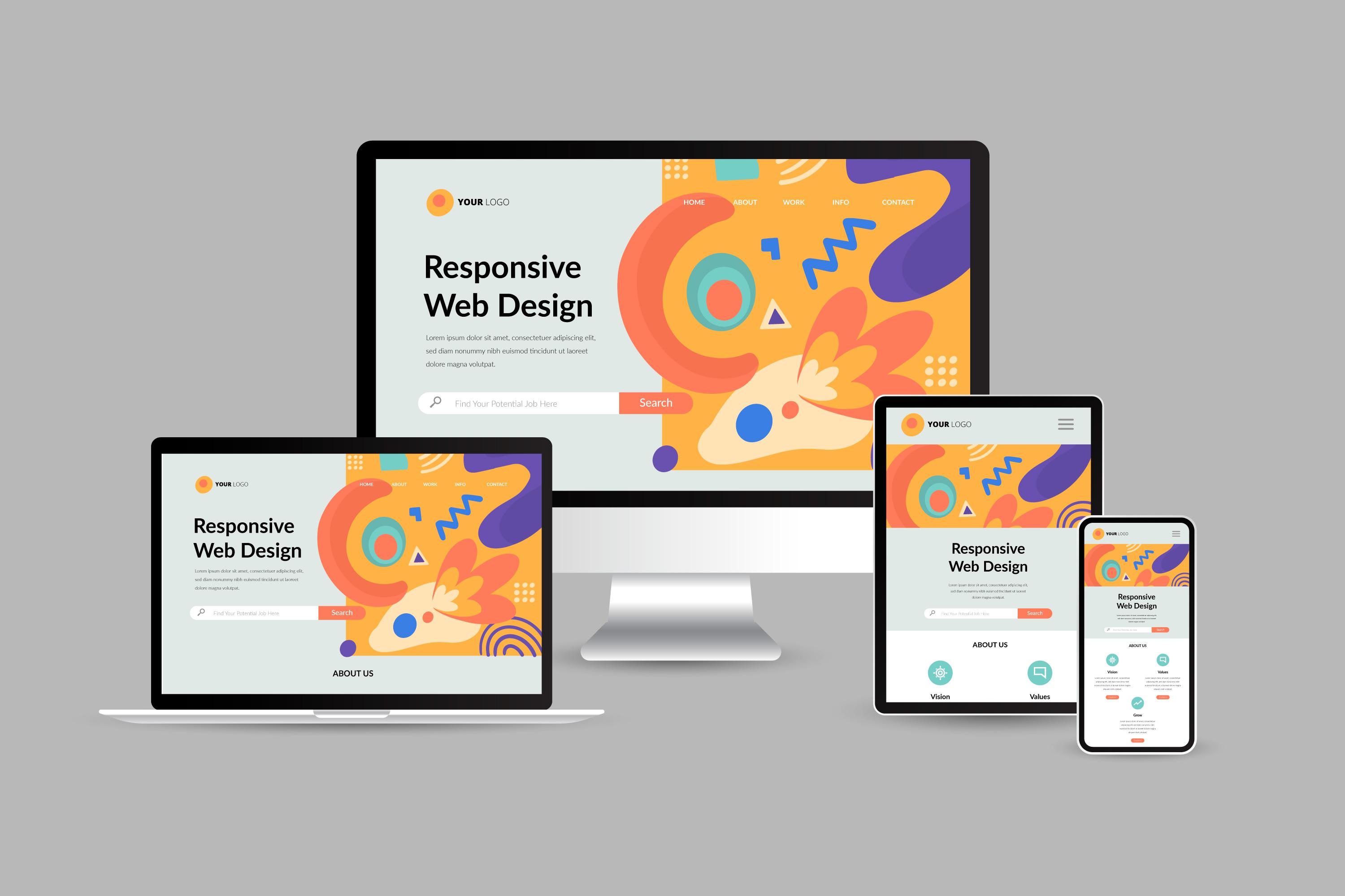
- Responsive Design: Adaptable layouts that function across various devices, meeting user expectations for convenience.
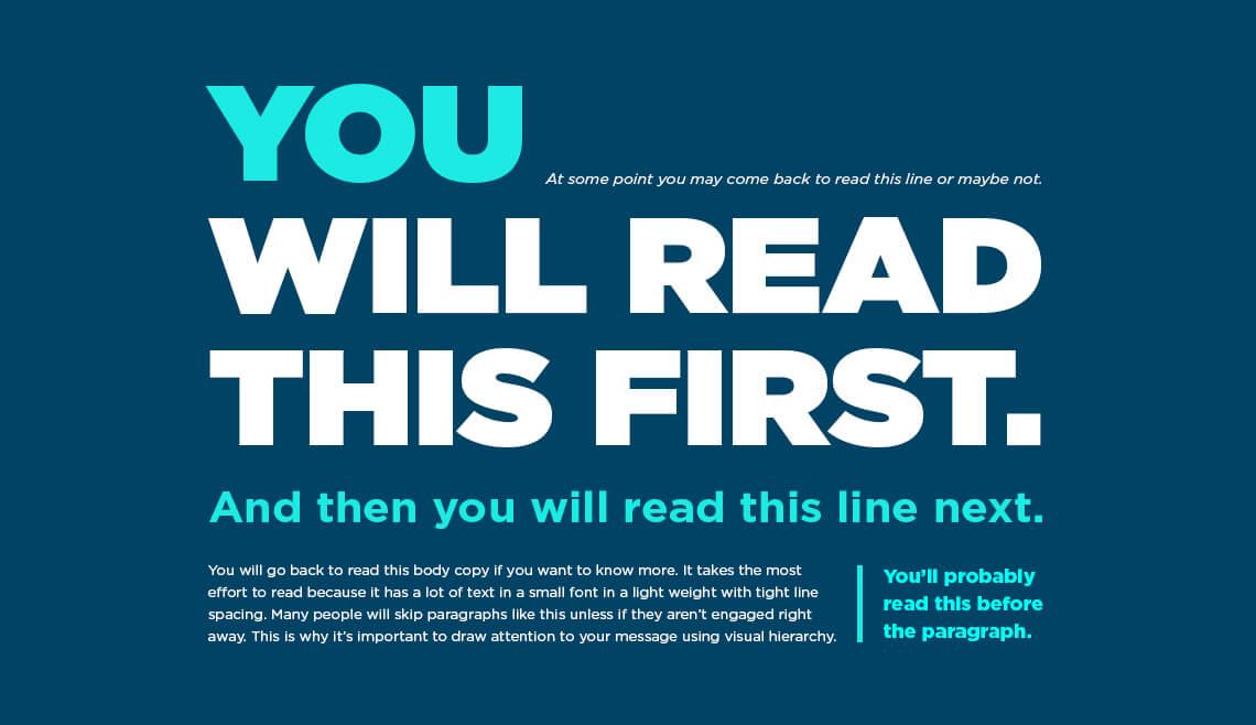
- Visual Hierarchy: Prioritizing content through size, contrast, and placement grabs attention where it’s needed most.
Understanding these preferences allows designers to create websites that feel natural to users, enhancing engagement and retention. A well-structured website not only attracts visitors but also nurtures their desire to return, ultimately fostering a loyal audience eager for more.

The Role of Visual Hierarchy in Effective Communication
Visual hierarchy plays a crucial role in guiding users through a website, influencing their attention and actions at every scroll. By strategically using elements such as size, color, contrast, and spacing, designers can create a roadmap for users, leading them to the most important information seamlessly. The arrangement of content not only improves readability but also enhances user experience. For example, larger headings tend to draw the eye first, while prominent buttons in contrasting colors can subtly guide users towards desired interactions, such as signing up for a newsletter or making a purchase.
A well-structured visual hierarchy helps in organizing information effectively, allowing users to digest content effortlessly. Consider the following key elements that contribute to an effective layout:
- Contrast: Differentiating elements to attract attention.
- Alignment: Creating a sense of order and connection.
- Repetition: Using consistent styles for cohesiveness.
- Whitespace: Enhancing focus on important content.
When employed thoughtfully, these design principles foster not just aesthetic appeal, but also functional clarity, ultimately supporting communication goals and enhancing user engagement.

Emotional Resonance: Designing for Connection and Engagement
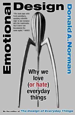
Creating a website that resonates emotionally with its users requires an understanding of key psychological principles. By implementing visual harmony and balance, designers can significantly enhance user experience. Consider these elements that contribute to emotional engagement:
- Color Psychology: Colors evoke emotions; for instance, blue instills calmness while red incites excitement.
- Visual Hierarchy: A well-structured layout guides users’ eyes naturally, promoting connection with content.
- Imagery and Icons: Relatable visuals can create a sense of belonging and familiarity.
Moreover, the way information is presented on a site can deepen user engagement. When designing, think about storytelling as a crucial tool. Here’s how to align layout with narrative elements:
| Story Element | Design Application |
|---|---|
| Character | Showcase users’ testimonials to create relatability. |
| Conflict | Highlight problems that your service solves using engaging graphics. |
| Resolution | Use compelling calls-to-action that outline benefits and next steps. |

Best Practices for Responsive Design and Accessibility
Creating a website that is both responsive and accessible requires an understanding of how users interact with digital spaces. When designing, it’s essential to focus on flexibility, ensuring that all elements of your site adjust seamlessly across different devices and screen sizes. Use fluid grids and relative units such as percentages and ems for layout components. Additionally, prioritize usability by minimizing the number of clicks needed for navigation and keeping essential content above the fold. A well-structured layout enhances comprehension and keeps visitors engaged, tapping into their cognitive preferences for organization and clarity.
Accessibility is equally crucial for maximizing your audience reach. To foster inclusivity, ensure your website adheres to WCAG (Web Content Accessibility Guidelines) by implementing the following practices:
- Use alt text for images to aid screen reader users.
- Provide sufficient contrast between text and background colors to improve readability.
- Implement keyboard navigation options to support users with disabilities.
Furthermore, consider using semantic HTML elements to reinforce meaning and improve the flow of information. A well-constructed layout that integrates these elements not only meets accessibility standards but also resonates with visitors on a psychological level, making them feel valued and understood.
The Conclusion
the artistry of website design is not merely about aesthetics; it is deeply rooted in the intricate dance of psychology and user experience. A thoughtfully crafted layout can evoke emotions, guide behavior, and ultimately forge a connection between the user and the content. As we navigate the digital landscape, understanding the principles behind effective design will empower creators to craft websites that are not only visually appealing but also profoundly engaging. The next time you embark on a design journey, remember that each element serves a purpose, each color tells a story, and every space invites exploration. By harnessing the insights of psychology, we can transform ordinary websites into extraordinary experiences, ensuring that they resonate with users in meaningful ways. As you ponder your own layouts, may you find inspiration in the subtle yet powerful influences of design, weaving together form and function in a harmonious symphony that captivates the audience you seek to engage.
