Transforming the Ordinary: A Web Design Evolution Journey
In an ever-evolving digital landscape, where first impressions hold the power to captivate or repel, the art of web design stands as a pivotal transformation. “Transforming the Ordinary: A Web Design Evolution Journey” invites readers to explore the intricate tapestry of creativity and technology that has shaped our online experiences. From the rudimentary beginnings of static pages to the dynamic, immersive environments of today, this evolution is more than just an aesthetic shift; it embodies a cultural moment that reflects our changing needs and aspirations. Join us as we delve into the milestones, challenges, and innovations that have propelled web design from the mundane to the extraordinary, illuminating how each pixel and line of code contributes to the broader narrative of connectivity and expression in the digital age.
Table of Contents
- Redefining User Experience Through Innovative Design Principles
- Harnessing the Power of Color and Typography to Elevate Aesthetics
- Crafting Compelling Narratives with Dynamic Content Strategy
- Embracing Responsive Design for a Seamless Multi-Device Experience
- The Way Forward

Redefining User Experience Through Innovative Design Principles
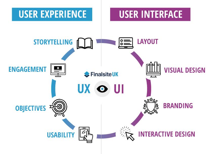
In the realm of web design, the shift from conventional to innovative is pivotal in crafting experiences that resonate with users. By embracing advanced design principles, we unlock the potential to engage audiences in new and dynamic ways. This transformation leverages a multitude of elements that prioritize functionality and aesthetic appeal. key aspects include:
- User-Centric Design: Tailored interfaces that prioritize the needs and behaviors of users.
- Responsive Elements: Adaptability to various devices ensuring fluid navigation.
- Microinteractions: Incorporating small, delightful animations that enhance user engagement.
- Accessibility Standards: Inclusive design approaches accommodating all users.
These principles collectively enhance the way users interact with digital platforms, ushering in an era where intuitive design meets advanced technology. As we continually refine our approach, it’s essential to evaluate the effectiveness of implemented strategies through user feedback and data analysis. Below is a simple table summarizing the evolution of user experience through innovative design:
| Year | Design Focus | Key Development |
|---|---|---|
| 2010 | Simplicity | Minimalist layouts gaining traction. |
| 2015 | Mobile-First | Responsive design standardization. |
| 2020 | Personalization | AI-driven user experience adaptation. |

Harnessing the Power of Color and Typography to Elevate Aesthetics
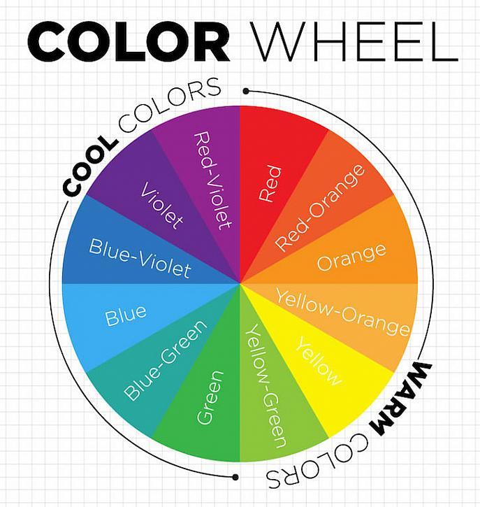
In web design, color is not just a visual element; it serves as a powerful communicator of brand identity and user experience. Selecting a cohesive color palette can evoke emotions, guide user behavior, and enhance overall aesthetics. Consider these principles when choosing colors:
- Contrast: Use contrasting colors to draw attention to essential elements such as calls to action.
- Harmony: Select complementary colors that resonate with your brand and create a sense of balance.
- Psychology: Understand the emotional impact of colors—blue can instill trust, while red can create urgency.
Typography, often overlooked, is equally crucial in developing a strong visual language. The right font can enhance readability, convey personality, and unify design elements. When considering typography, keep in mind:
| Font Type | Usage |
|---|---|
| Serif | Ideal for traditional brands that want to convey authority. |
| Sans-serif | Best for modern and minimalistic designs that require clarity. |
| Display | Great for headlines and creating a unique brand presence. |

Crafting Compelling Narratives with Dynamic Content Strategy
In this ever-evolving digital landscape, the interplay between design and narrative is more crucial than ever. By weaving together stunning visuals and compelling storytelling, we can elevate a user’s experience from mere interaction to a truly immersive journey. This synergy can be achieved through a few key strategies:
- Engaging Storylines: Showcase user testimonials or case studies that highlight individual transformations through your design.
- Visual Cohesion: Ensure that your design elements do not just serve a functional role but also act as narrative devices, guiding users through the content.
- Interactive Features: Implement dynamic elements such as sliders or animated graphics that respond to user input, making the experience more engaging.
Furthermore, it’s essential to analyze how different content types can be used to support a rich narrative. Consider the following table, which outlines various content forms and their potential impact:
| Content Type | Purpose | Impact on Narrative |
|---|---|---|
| Blogs | Inform and educate | Builds context and authority |
| Videos | Engage and demonstrate | Evokes emotion and creates connection |
| Infographics | Simplify complex information | Enhances understanding and retention |
By employing a mix of these strategies and content types, web designers can not only capture attention but also retain interest, making every visit a memorable part of the user’s journey. Tailoring each element to appeal to both logic and emotion ensures that your digital story resonates long after the user departs.

Embracing Responsive Design for a Seamless Multi-Device Experience
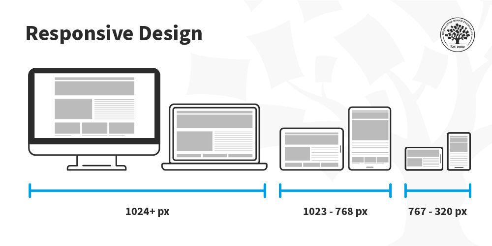
As the digital landscape evolves, the demand for a cohesive user experience across all devices has never been greater. Embracing responsive design allows businesses to adapt their websites fluidly to various screen sizes, from smartphones to large desktop monitors. By focusing on flexible layouts, scalable images, and media queries, developers can create web pages that not only look stunning but also perform seamlessly regardless of the device. The journey towards this adaptability involves understanding user behavior and tailoring the design to meet their needs, ensuring that every user feels prioritized, no matter how they access the site.
Incorporating responsive design is not just a trend; it’s a vital aspect of modern web development. Here are some fundamental principles to keep in mind:
- Fluid Grids: Utilize percentage-based widths to create content that adapts securely to varying screen sizes.
- Flexible Images: Ensure images scale appropriately with containers, avoiding distortion and maintaining quality.
- Media Queries: Implement CSS rules that apply specific styles based on the device’s characteristics.
To illustrate the impact of responsive design, consider the following comparison of user experience metrics:
| Device Type | Average Session Duration | Bounce Rate |
|---|---|---|
| Mobile | 4:30 mins | 40% |
| Tablet | 5:00 mins | 35% |
| Desktop | 6:15 mins | 30% |
This data exemplifies how responsive design can enhance user engagement and retention across varied platforms, making the effort to implement it well worth the investment.
The Way Forward
As we step back from this exploration of web design, it’s clear that transforming the ordinary into the extraordinary is an ongoing journey, one shaped by creativity, technology, and the ever-evolving needs of users. Each pixel, every line of code, is a brushstroke in a larger canvas that reflects our society’s values, aspirations, and innovations. Just as artists grow through their experiences, so too do designers adapt and refine their craft, driven by the same desire to connect and inspire.
As we look ahead, the future of web design promises even more remarkable transformations. New technologies will emerge, user behaviors will shift, and aesthetic preferences will continue to evolve. However, the underlying goal remains constant: to create experiences that resonate, are accessible, and engage all who interact with them.
In this journey, every design is an opportunity—a chance to turn the mundane into something memorable. So, whether you’re a seasoned designer, a curious novice, or an interested observer, remember that every website holds the potential for transformation. Together, let’s embrace innovation, celebrate creativity, and continue to shape the digital landscape into a space where the ordinary can flourish in extraordinary ways.
