Speed Up Your Site: Mastering Image Optimization Techniques
In today’s fast-paced digital landscape, where attention spans waver and seconds matter, the performance of a website can make or break user engagement. Among the myriad of elements that contribute to a site’s time-saving-wordpress-hacks/” title=”Unlocking Productivity: Time-Saving WordPress Hacks”>load time, images often play the most pivotal role—offering both an aesthetic appeal and a potential hindrance to speed. As enticing as vibrant visuals may be, their impact on a site’s efficiency can be profound. This is where the art and science of image optimization come into play. In this article, we will delve into innovative techniques and strategies that can transform how you manage images on your site, enhancing not just the speed but also the overall user experience. Whether you’re a seasoned web developer or a small business owner looking to improve your online presence, mastering these image optimization techniques will empower you to strike the perfect balance between visual richness and performance. Join us as we explore the essential practices that can help you speed up your site and keep your audience captivated.
Understanding the Impact of Image Optimization on Site Performance
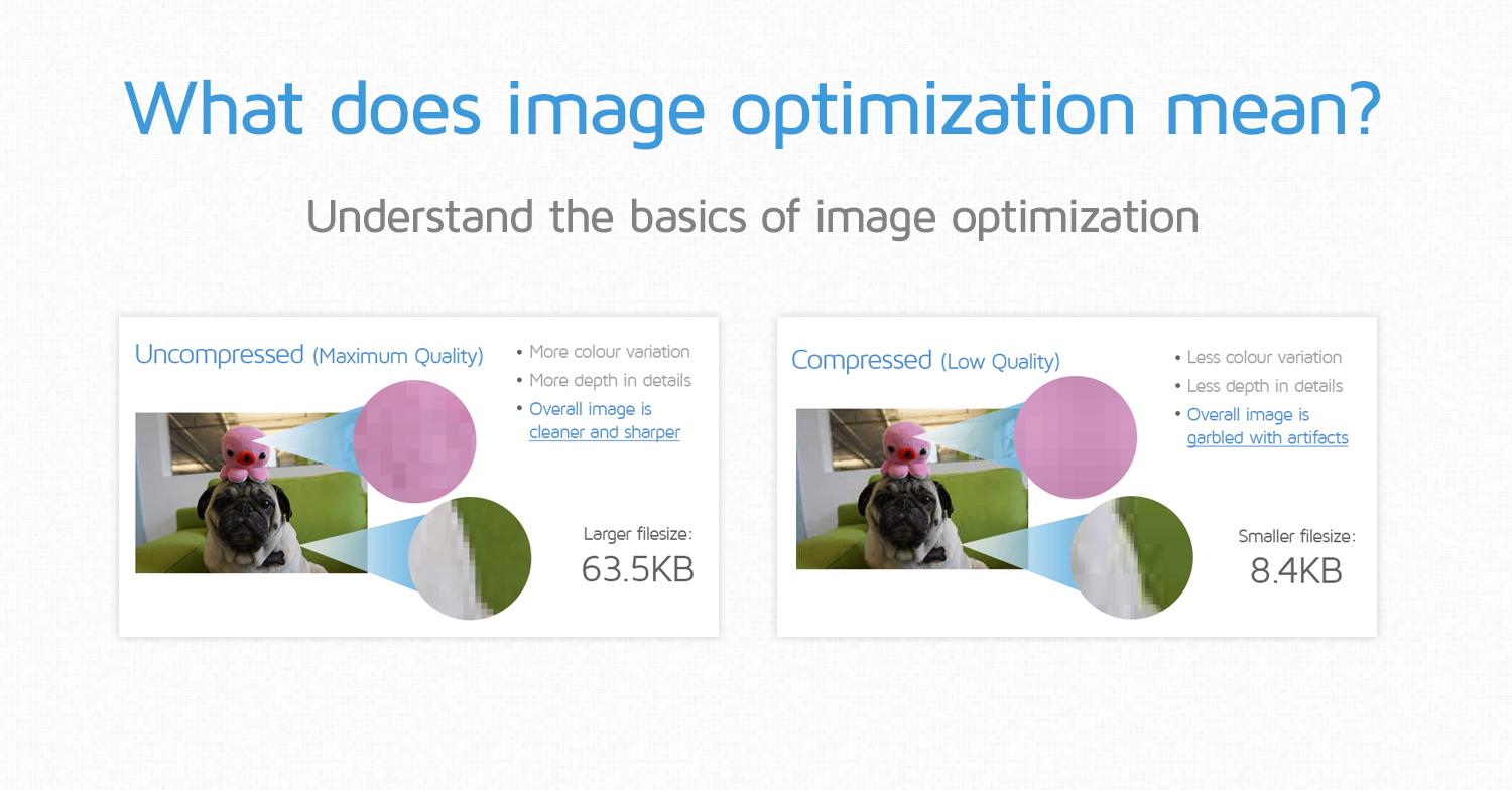
Image optimization is one of the key elements determining the speed and efficiency of a website. Large, uncompressed images can significantly slow down loading times, leading to a frustrating user experience and higher bounce rates. By employing effective image optimization techniques, you can reduce file sizes without sacrificing quality, ensuring your website loads faster. Consider these approaches:
- Compression: Use tools like TinyPNG or ImageOptim to compress your images.
- Appropriate Formats: Choose the right file format for your images, such as JPEG for photographs and PNG for graphics with transparency.
- Responsive Images: Implement the
srcsetattribute to serve different image sizes based on the user’s device. - Lazy Loading: Load images only when they are visible in the viewport to reduce initial page load times.
Moreover, the impact of image optimization extends beyond speed; it enhances your site’s SEO performance too. Search engines consider page speed as a ranking signal, making it imperative to optimize images. A faster site not only improves user satisfaction but can also lead to higher conversion rates. To better visualize the benefits, refer to the table below:
| Benefit | Impact |
|---|---|
| Reduced Load Time | Improves user experience |
| Lower Bounce Rate | Increases time spent on site |
| Enhanced SEO | Boosts search engine rankings |
| Higher Conversion Rates | Increases sales and leads |

Choosing the Right Format: Navigating Image Types for Maximum Efficiency
When it comes to optimizing images for your website, the format you choose can significantly impact both loading speed and visual quality. Here’s a quick breakdown of the most common formats you should consider:
| Format | Best For | Key Features |
|---|---|---|
| JPEG | Photographs | Lossy compression, great for rich colors |
| PNG | Logos & Graphics | Lossless compression, supports transparency |
| GIF | Animations | Limited color palette, low file size for simple graphics |
| WEBP | All-purpose | Superior compression, maintains quality |
Each format serves a distinct purpose, allowing you to cater to the specific needs of your website. For example, if you’re showcasing stunning photographs, JPEG offers excellent compression without sacrificing much quality. In contrast, PNG is ideal for images that require a transparent background or sharp lines, like logos and icons. Embracing the WEBP format is also a smart choice, as it combines the advantages of both JPEG and PNG, delivering high-quality visuals with smaller file sizes. By carefully selecting the right format, you can enhance your site’s efficiency and user experience.

Techniques for Compression: Balancing Quality and Load Speed
When it comes to optimizing images for the web, striking the right balance between quality and load speed is essential. Utilizing various compression techniques can significantly reduce file sizes without sacrificing visual integrity. Two widely used methods are lossy and lossless compression. Lossy compression reduces file size by permanently eliminating some image data, often resulting in minor quality degradation. Conversely, lossless compression retains all original data, ensuring image quality is preserved while achieving moderate size reductions. Here are some effective techniques:
- Use tools like Adobe Photoshop for selective compression settings.
- Leverage online services such as TinyPNG for quick lossless compression.
- Consider using the WebP format, which offers superior compression.
Another vital aspect of image optimization is choosing the right dimensions for website use. Serving images that are larger than necessary can lead to excessive load times. Resizing images to match the display size is crucial. To facilitate this, employing responsive images with the srcset attribute ensures that the right image size is delivered for various devices, enhancing both speed and quality. Below is a simple comparison of image formats:
| Format | Compression | Best Use Cases |
|---|---|---|
| JPEG | Lossy | Photographs |
| PNG | Lossless | Graphics with transparency |
| WebP | Both | Web images |

Implementing Responsive Images: Tailoring Content for Every Device
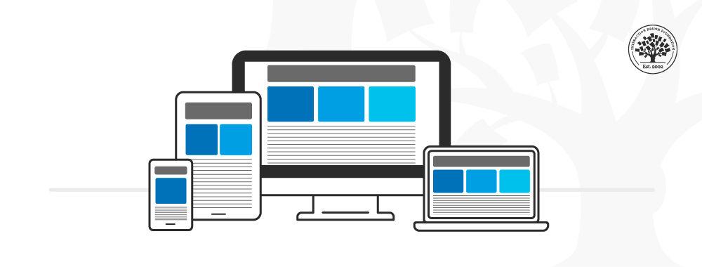
In today’s digital landscape, ensuring your images look stunning on all devices is paramount. Implementing responsive images involves using techniques such as the srcset attribute and the sizes attribute, which allow the browser to select the most appropriate image based on the user’s screen size and resolution. This means your images can be tailored seamlessly for various devices, enhancing user experience without compromising on loading speed. Here’s how you can set up responsive images effectively:
- Use the
srcsetAttribute: This allows you to specify multiple image sources for different resolution scenarios. - Implement the
sizesAttribute: Define how much space your image will take up in different viewport sizes. - Optimize Your Images: Always compress your images to ensure they don’t weigh down your site’s performance.
In addition to these techniques, consider utilizing the picture element for art direction, allowing for different images to be displayed based on screen size. This is particularly useful for showcasing landscape or portrait images effectively on mobile versus desktop platforms. Below is a simple comparison of various image formats and their ideal use cases:
| Image Format | Best For | Key Advantages |
|---|---|---|
| JPEG | Photographs | High compression, good detail retention |
| PNG | Graphics and logos | Supports transparency, lossless compression |
| WebP | Web images | Superior compression, quality preservation |
The Conclusion
In the ever-accelerating digital landscape, the importance of swift loading times cannot be overstated. As we conclude this deep dive into image optimization techniques, remember that every pixel counts. By mastering the art of effective image sizing, choosing the right formats, and leveraging tools for compression, you hold the power to significantly enhance your site’s performance.
The journey to a faster, more efficient website is ongoing, but with each optimization, you inch closer to a seamless user experience that captivates visitors and boosts engagement. So, take these insights and transform your web presence—because a speedier site isn’t just a technical achievement; it’s a vital investment in user satisfaction and long-term success.
Now, it’s time to roll up your sleeves and apply these strategies to your own digital canvas. Optimize, accelerate, and watch your site soar!
