Harnessing Gradients for Modern Aesthetics
Harnessing Gradients for Modern Aesthetics: A Journey Through Color and Design
In a world where visual stimuli constantly compete for our attention, the art of design has evolved into a vibrant canvas rich with possibility. Among the myriad techniques that shape contemporary aesthetics, gradients have emerged as a powerful tool, capable of evoking emotion and defining brand identities with seamless elegance. This article delves into the dynamic realm of gradients, exploring their resurgence in modern design and how they are being harnessed across various mediums—from digital interfaces to interior spaces. By examining the principles behind gradient application and its impact on visual storytelling, we invite you on a journey to discover the transformative potential of color transitions in crafting experiences that are both striking and memorable. Join us as we unravel the interplay between technology, creativity, and the ever-evolving standards of beauty in the digital age.
Table of Contents
- Exploring the Color Spectrum: The Emotional Impact of Gradients in Design
- The Art of Transition: Creating Visual Harmony with Gradient Techniques
- Practical Applications: Enhancing User Experience through Gradient Use
- Future Trends: Innovations in Gradient Design for Digital and Print Media
- The Way Forward

Exploring the Color Spectrum: The Emotional Impact of Gradients in Design
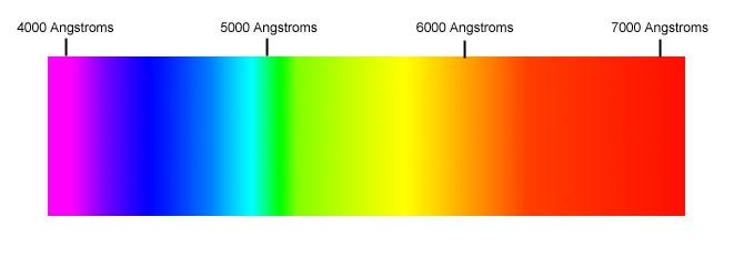
Gradients serve as a dynamic tool in design, capable of evoking a multitude of emotions, enhancing user experience, and creating depth in digital spaces. By blending two or more colors, designers can communicate distinct feelings and themes, thereby influencing audience perception. For instance, a soft blue-to-green gradient is often associated with tranquility and growth, making it a popular choice for wellness brands. Alternatively, a fiery red-to-orange gradient can evoke energy and passion, perfect for brands wanting to convey excitement or urgency. Such color combinations allow for a versatile palette that can be tailored to match a brand’s identity while enhancing its visual appeal.
Moreover, the application of gradients can transform ordinary interfaces into visually engaging experiences. These color transitions can be utilized in various elements such as backgrounds, buttons, and text overlays. Implementing gradients effectively involves understanding their psychological impact, as well as considering their placement and movement within a design. Here are some favored combinations that showcase the emotional resonance of gradients:
- Pink to Purple: Romantic and whimsical.
- Blue to Purple: Calm and serene.
- Yellow to Orange: Joyful and cheerful.
- Dark to Light Blue: Trustworthy and professional.
By thoughtfully selecting gradients that align with the desired emotional outcome, designers can not only elevate their work but also create a stronger connection with their audience. This strategic use of color can transform designs from mere visuals into narrations of mood and sentiment, pushing the boundaries of how we interpret and interact with digital experiences.

The Art of Transition: Creating Visual Harmony with Gradient Techniques
Gradients have evolved beyond mere color transitions; they are now essential elements in contemporary design that convey depth, emotion, and dynamism. By thoughtfully combining hues, designers can generate visual narratives that resonate with audiences. Techniques such as linear, radial, and angular gradients not only enhance aesthetic appeal but also guide the viewer’s eye strategically across the composition. Here are a few ways gradients can be implemented effectively:
- Backgrounds: Setting a gradient background can create an inviting atmosphere, making content more engaging.
- Buttons and CTAs: Gradient buttons stand out, increasing clickability and drawing attention to key actions.
- Text Effects: Applying gradients to text can add excitement and visual interest that captivates readers.
To ensure seamless integration, utilize tools like CSS functions to control gradient direction and color stops effectively. A gradient palette can be crafted using harmonious colors that reflect brand identity while maintaining visual integrity. Below is a simple representation of how gradient selections can impact design:
| Gradient Type | Color Examples |
|---|---|
| Linear | #FF5733 ➜ #FFC300 |
| Radial | #DAF7A6 ➜ #581845 |
| Angular | #C70039 ➜ #900C3F |

Practical Applications: Enhancing User Experience through Gradient Use
In the ever-evolving digital landscape, utilizing gradients can significantly elevate the user experience by creating a visually engaging environment. When incorporated thoughtfully, gradients can guide users’ attention and enhance the overall aesthetic appeal of a website or application. For instance, applying a subtle gradient as a background can provide depth, making flat elements appear more dynamic. Consider the following techniques for effective gradient use:
- Background Gradients: Incorporating gradients in backgrounds can create a soft, inviting space that encourages users to explore further.
- Button Highlights: Applying gradients to buttons not only makes them stand out but also adds an interactive feel that can increase click-through rates.
- Text Effects: Overlaying gradient colors on text can create a unique visual hierarchy, helping vital information pop while maintaining a cohesive look.
Moreover, gradients can be strategically employed to communicate brand identity and evoke emotional responses. By selecting colors that align with the brand’s message, gradients can reinforce recognition and connection with users. To illustrate this concept, consider the following table showcasing popular color combinations and their associated feelings:
| Gradient Color Combination | Associated Emotion |
|---|---|
| Blue to Purple | Trust and Creativity |
| Red to Orange | Passion and Energy |
| Green to Yellow | Growth and Optimism |

Future Trends: Innovations in Gradient Design for Digital and Print Media
As we move further into the digital age, the evolution of gradient design is reshaping both digital and print media. Designers are leaning into dynamic gradients that shift and blend in response to user interactions, creating visually engaging experiences that captivate audiences. Soft transitions, multi-dimensional layers, and interactive elements are becoming hallmarks of contemporary design. This trend not only enhances aesthetic appeal but also guides user navigation and interaction, making the gradients themselves feel like a part of the content rather than just background elements.
Emerging innovations are also beginning to blur the lines between dimensionality and flat design. With advancements in print technology, techniques like digital embossing and textured gradients are paving the way for physical materials that echo the vibrancy of digital design. The integration of AI-powered design tools allows creatives to experiment with gradients beyond traditional palettes, facilitating a trend towards custom, data-driven gradients that can be tailored to target demographics. These shifts are fostering a new era of visual storytelling, where color transitions embody brand identity and evoke emotional responses from the audience.
The Way Forward
In the ever-evolving landscape of design, gradients stand as a testament to creativity’s resilience and adaptability. From subtle blends that evoke tranquility to bold transitions that command attention, gradients have transcended their humble origins, emerging as a powerful tool in the arsenal of modern aesthetics. As we embrace the complexities of color and light, we are reminded that beauty is often found in the interplay of contrasts— where shades meet and fuse, creating visual poetry.
As we look ahead, let us continue to explore the infinite possibilities that gradients offer. Whether in digital art, branding, or interior design, these dynamic color transitions challenge us to reimagine spaces and experiences, inviting intrigue and engagement. By harnessing the subtle yet profound impact of gradients, we can craft designs that resonate deeply, fostering connections and evoking emotion.
In this journey through color, we are encouraged to experiment, to push boundaries, and to embrace the potential that lies within each gradient. The future of aesthetics is vibrant, fluid, and ever-changing— a canvas waiting for the brush of innovation. Let us wield that brush with courage, and may our creations inspire new stories in the realm of design.
